How a Bus Driver Had the Idea That Won a Nobel Prize
In 1961, two small proteins from crystal jellyfish that produced blue-green light were discovered.
One glowed blue when binding to calcium, while the other absorbed this blue light and glowed green itself.
An American scientist called Douglas Prasher, who was working on jellyfish at the time, hypothesized that one could use the latter protein for imaging purposes.
This is a picture of the crystal jellyfish (Aequorea victoria) and its glow. Although it contains GFP, it’s glow is perceived as blue as we see its aequorin related bioluminescence (not fluorescence) here.
Link it to another protein, and it should glow green when blue light is shone on it. This was the birth of GFP in biochemistry.
However, this was the 1980s. You had to find the DNA – without sequencing. That meant isolating the tissue of the jellyfish that produced GFP and extracting the DNA.
In 1987, this American scientist took on the challenge.
Searching for GFP’s Sequence
So: catch jellyfish and isolate the glowing tissue. Then, identify the right DNA.
In 1987, Douglas Prasher worked on GFP at the Woods Hole Oceanographic Institution in Massachusetts. In 1988, Prasher received a $200,000 grant from the American Cancer Society. They understood the vision of using GFP to study cancer cells. PS: The institution exists still today.
The science behind it was quite laborious. Especially for all our younger readers, here is how it worked: you would take the protein form of GFP and cut it at methionine residues with cyanogen bromide (CNBr). You would sequence it via Edman degradation (labeling the free N-terminal amino acid, removing it, and analyzing it via HPLC).
From there, you would know the amino acid sequence and could theorize which underlying DNA sequence encoded it. However, at the time, you couldn’t just synthesize long DNA sequences as you liked, so you needed to find the right stretch in the jellyfish DNA.
Therefore, you would construct cDNA libraries: snippets of expressed genes, meaning DNA copies of mRNA, inserted into bacterial plasmids or phages. You would work with probes that bind to these fragments. Then, you would sequence them and search for the correct match. Once you found it, you could excise the piece with restriction enzymes and replicate it through bacteria or PCR.
To do all of that, Prasher apparently had to cut open more than 10,000 jellyfish!
He humorously described the look of his work as a bucket of “translucent linguini.”
Great Highs And Big Struggles
At some point, he received an important call.
It came from a biologist at Columbia University – Martin Chalfie. He also had the idea to track proteins via GFP and asked Prasher for the sequence. However, at the time, Prasher had not yet obtained the GFP DNA sequence, but he promised to reach out once he did.
A little later, Prasher called back, but Chalfie was on sabbatical. A student took the call and said he would forward the message. He never did.
In the meantime, however, Prasher succeeded. He published his work in 1992.
If you are interested, you can access the original paper “Primary structure of the Aequorea victoria green-fluorescent protein” published in Gene right here.
He went on to turn his findings into an application. Expressing GFP in bacteria was now possible.
But there was an issue: the GFP didn’t glow.
He tried various bacterial strains—it didn’t improve.
However, his institute was focused on marine biology, and among his colleagues, he was essentially an outcast.
There was nobody to help him, and many looked at him with doubt.
He simply couldn’t figure it out. At some point, Prasher’s grant ran out.
And No One Came to Help
He applied elsewhere, for example at the NIH, but was rejected.
His frustration grew to the point where he was genuinely miserable. This, combined with the need to support his family, made him stop.
He went on to work for the USDA, fighting agricultural pests. Later, he worked for NASA. But both projects eventually lost their funding.
Prasher ended up as a bus driver for Toyota, shuttling customers.
However, apart from this paper, something happened in 1992 that would change the fate of biology.
Shortly after his paper was published, Prasher got another call from Chalfie.
The Science Lives On
He was back from his sabbatical, had seen the paper, and was frustrated that Prasher hadn’t told him. Both later understood what had happened. However, at that time, Prasher had already run out of grant money. Chalfie asked him to share the sequence so he could continue the work.
Prasher still deeply believed in GFP. He sent the sequence to Chalfie.
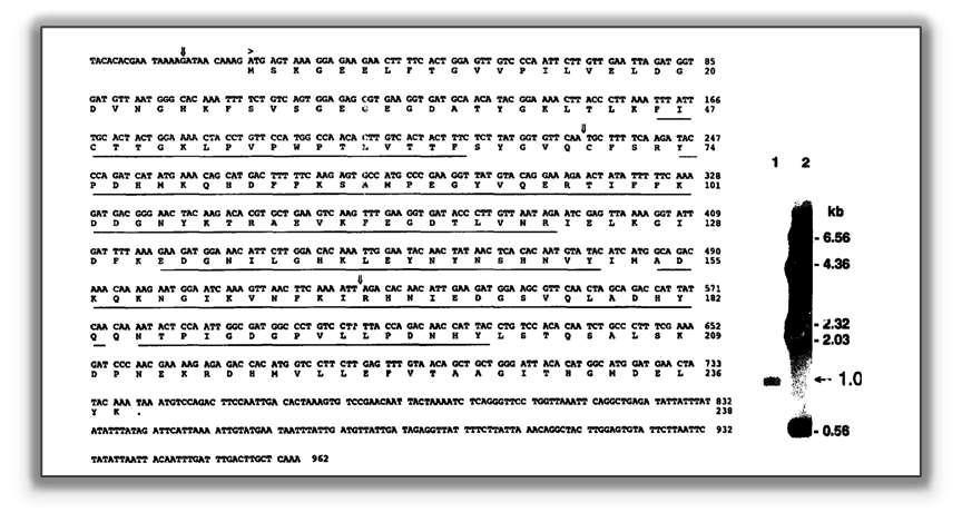
It is this (not complete) sequence of GFP that Prasher likely shared. This is figure two from his publication.
He also sent a copy to Roger Tsien in San Diego, who had contacted him as well.
According to Prasher, it wasn’t pressure but the hope that GFP would reach its full potential that drove him. Sharing his work upon ending his career caused a strange feeling, but he went with it.
And indeed, Martin Chalfie and his PhD student Ghia Euskirchen made GFP glow.
The key was a different approach. It seems that the restriction enzymes Prasher had used left an overhang. Chalfie and Euskirchen found the correct enzymes. They made GFP glow – first in bacteria, then in worms.
For this, they were featured on the front page of Science.
This is the cover of the The cover of Science magazine from 1994 showing GFP in C. elegans neurons.
Meanwhile, Roger Tsien also advanced the field. He was the one who modified GFP to glow cyan, red, or yellow by altering one of three essential amino acids. Additionally, he helped increase GFP’s fluorescent signal.
Then came 2008.
A Nobel Prize
The Nobel Prize committee announced three winners: Chalfie, Tsien, and Osamu Shimomura, who had originally isolated the GFP protein.
No Prasher.
He heard about it on the radio.
His feelings were mixed. On the one hand, he was disappointed and angry. The Nobel Prize can only be shared among three scientists, and he wasn’t mad at the other scientists, whose work he appreciated. He was more frustrated with how life had apparently treated him.
On the other hand, he was proud. In the end, it was his vision that had proven correct. Although he couldn’t continue his research, it was also thanks to him that GFP was used in laboratories all around the world.
Furthermore, he had genuinely enjoyed his job at NASA, and even being a shuttle driver had its advantages. He described science as a very lonely pursuit, whereas in his other jobs, he was able to socialize much more.
Nevertheless, the story has another twist.
The Lasting Lesson
In the end, Prasher never lost his passion for research, and Tsien even offered him a position in his lab.
At first, Prasher declined.
Perhaps it was pride, but he also said he wasn’t sure whether he had missed too much during his time away.
Eventually, however, he agreed, working in Tsien’s lab from 2012 to 2015.
Probably the most famous picture of GFP and it’s “derivatives” from the Tsien lab.
All three Nobel laureates thanked Prasher in their speeches, and Chalfie even stated they could have left him out in favor of Prasher.
However, all of this shows that you should never give up on your dreams.
Remember: just about three hours after Carol Greider received the news that she had been awarded the Nobel Prize, she also learned that her grant had been rejected – it was even deemed “not worthy of discussion.”
It won’t always be easy, but sometimes you simply have to persevere.
In 1992, Nature rejected a paper by Peter Ratcliffe. It was the paper that would later earn him a Nobel Prize.
If you believe in something, go for it.
If you want to read even more about Prasher’s story, this article contains additional details.
If you ask a random scientist, they might come up with something like this: science is a systematic approach to arriving at the truth.
What if this definition is inaccurate – or simply wrong?
What if even core features like reproducibility or falsifiability do not help us move forward?
Is science simply what the majority of scientists intuitively agree it to be?
Here are unexpected challenges in defining what science actually is.
PS from Patrick, the author: I hope it will be a fun and intriguing read for you. It’s a slightly longer article, as it’s meant to take you on a little journey, offering a brief escape from day-to-day stress.
At first, most scientific initiatives do not really aim to find a final truth.
That becomes very obvious if you think about what most of our research is about. It is, for example, about curing cancer or helping patients with Alzheimer’s.
It’s not really about looking for the perfect characterization of a cancer cell. Rather, we are looking for a treatment.
Did you ever read about the average distance a mitochondrion moves in a cell? Probably not. Although research has been conducted on mitochondrial transport (e.g., in neurons) braoder floating didn’t attract much attention since it does not seem to be involved in any research topic worth investigating.
Curiosity-driven basic research can address questions that are not directly applicable. However, the common goal is to understand principles behind evolution, metabolism, or protein folding that can later be applied to other questions through the investigation of a more accessible model.
What we normally don’t notice is that while we search for basic principles, we do not really do it for the sake of truth. Rather, we treat truth as a surrogate for reliability, certainty, or robustness.
For example, we rarely care about the “true response” of proteins, bacteria, or cells. We study the effects of our interventions in laboratory settings to derive an understanding of principles that can be used to better predict and shape the world around us.
A prime example is our research involving cell lines. It has been well established that cancerous cell lines carry a staggering number of mutations, telling us little about the behavior of a “normal” cell1,2. We use fairly simple 2D cultures instead of complex tissue matrices. We apply bovine serum despite it dramatically affecting the response of the cells cultured in it3,4.
In other words, we do not search for truth; we use models that help us assess our hypotheses or reach our goals.
Here is a weird yet instructive thought: if you heard someone say they studied the folding of proteins in Coca-Cola, you would not readily think of that as scientific.
However, Coca-Cola seems more standardized than FBS or Matrigel. Moreover, we could observe and reproduce findings – core pillars of scientific investigation.
Yet we immediately have the feeling that studying proteins in a sugary beverage does not really make sense; it seems useless, deranged, and contingent in its approach. Therefore, it does not feel scientific. However, the true behavior of proteins exists everywhere.
We seek novel insights that have meaning, rather than debating what truth is or whether abstraction from a large body of independent laboratory findings can ever help us truly understand complex real-world systems.
As a result, we measure the impact of our work in citations and recognition. Doing science is inherently connected to funding, but also to our human psyche, which assigns meaning only when there are implications.
But now we might wonder whether we are still talking about science or whether we drift into engineering.
Going back to a long-standing debate5, science is often understood by scientists as a more abstract approach to arriving at the fundamental principles and working mechanisms of the world around us. We do not simply try things out and stop there. We want to understand how they work.
And yet, we often behave differently. Think about one of the greatest scientific discoveries: the discovery of penicillin. It happened by accident. Furthermore, the scientific community did not really care about the finding(s) for almost a decade – it was perceived as having no meaningful implications.
However, we could still argue that science is not a thing in itself; it is a methodology. Thus, it is not about penicillin, it is about the kind of work that characterized it.
I.e., it is a certain kind of approach that makes something scientific. We commonly hear features like observability, testability, or reproducibility cited as criteria for defining science.
Still, these also prove insufficient.
Let’s just ask ourselves how many of these features there are. What about quantifiability, generalizability, or predictive power? How many of them have to be met before we call something science? There is no final answer to this question.
Furthermore, when we try to define each of these features individually, we quickly realize how volatile they are.
Is reproducibility meant technically or pragmatically, and to what extent do we allow for variation in results? Overall, we have to admit that the results of a large fraction of scientific work are not properly reproducible.
But even on a theoretical level, these factors seem insufficient.
Testability (or, in Popperian terms, falsifiability) falls short at some point. For example, if someone argued that they were investigating whether thoughts can kill bacteria, we would struggle to call this a scientific endeavor.
By the same token, someone claiming that there is a piece of cheese at the core of the Moon feels ridiculous, but is it because we cannot properly falsify this? We could falsify it through thorough investigation. However, can you ever falsify that protein folding is temperature-dependent?
Maybe we should stop debating about one factor or another, because something needs sufficiently many of these features we listed to be considered scientific.
But then, what counts as sufficiently many?
There was an interesting debate in the 20th century when some “scientists” claimed that the shape of the skull determines intelligence or character traits. Intuitively, this does not sound scientific today.
And for many scientists, it was not then. But for several years there was an ongoing debate about whether this was actually science, not least because parts of the public perceived it as such. Universities were even about to open capacities for these topics5.
Obviously this approach was testable; it was, to some extent, quantifiable, and so forth. In the end, it fell short partially because one couldn’t really establish a proper system and therefore couldn’t reproducibly teach it to other people.
The entire framework could at best work retrospectively when one knew about a person’s character, as the bumps on one’s skull obviously had little to do with character traits. What’s important for us to note is that one couldn’t abstract the practice into a coherent biological system. However, this is not uncommon even for real scientific breakthroughs.
We know that paradigm shifts, before they are accepted, are often approached with skepticism (to say the least).
For us, epigenetics is an established concept6. But to postulate a number of decades ago that overfeeding mice would make the second generation of offspring more vulnerable to metabolic diseases and that this has to do with changes in DNA that are not related to the genetic sequence itself would have seemed more than questionable7. Indeed, very few people would have thought you were a proper geneticist or biochemist.
We judge science based on our current model of the world. Yes, innovative work needs to provide evidence, but more than that, it must be congruent with our established models.
That often happens once so much new information is available that we can arrive at a new coherent system – paradigm shifts don’t occur because we know what is scientific a priori.
We face similar challenges with fields such as neuroimmunology today. Let’s return to the idea that thoughts might kill bacteria. There are peer-reviewed case studies in which people, simply through meditative practices, become more resistant to streptococcal infections.
Scientific evidence? The key issue is how we connect these findings to our current understanding, not what one investigation or another finds.
Let’s therefore take this perspective: through our thoughts we can affect the type and level of neurotransmitters as well as hormones that are released. In turn, this affects immune cells.
There is a vast amount of literature showing that neurotransmitters regulate immune cells8,9, and that cytokines produced by immune cells can affect neuronal activity10 and even cause different mental states11. Even more obvious is that we salivate when we see food, and the lysozyme in our saliva can kill bacteria (even though these are rarely problematic pathogens).
Doesn’t it feel much more scientific to say: this investigation focuses on how thought patterns might affect the viability of pathogens through neuroimmune interactions?
Investigations can be confounded, and as famously noted by quantum physicists, all too often we can only see what we know we have to look for.
Of course, by conducting several studies and investigating problems from different angles, we are able to arrive at intersubjective concepts and mechanisms of the world. But what gets us there is not always considered scientific from the start.
Thoughts or character traits often feel unscientific because we generally associate science with the investigation of the world around us.
Introspective approaches are normally not considered scientific because they are too subjective and therefore difficult to quantify intersubjectively. It remains an ongoing debate whether psychology (or which branches of it) is science, or whether they would even benefit from what we call a scientific approach.
In that sense, any scientifically derived evidence must be obtained in a way that allows other people to arrive at the same conclusions.
However, could we then consider mathematics to be science? Or do we count it as logic? Without going too deeply into other philosophical debates about linguistics, we can extend this question to theoretical physics.
Here again, we see the struggle with “truth.” What we are doing as scientists is often neither final nor systematic. We do not test across a large range of concentrations, crossing with different time points and models just to find the “true effect.”
For us, it is much more about relevant novelty, even though that leaves many gaps in our understanding.
Asking whether mathematics is science, what truth is, what truly constitutes proof, or what constitutes true causation is perceived as a philosophical debate.
So science is not fully applied, but also not merely theoretical. It’s about principles – but somehow what we might call relevant principles, because we would think of somebody who does something that obviously has no merit as “deranged.”
And still, we see with penicillin and other breakthroughs that doing what seems useless can be an important, maybe even necessary, activity.
In other words, innovative thinking that is not accepted by the larger scientific community can still prove to be groundbreaking. (No doubt, we shouldn’t forget that it is also frequently the case that such ideas are eventually proven to be mistaken.)
It then seems that what most scientists are really doing on a daily basis is research?
We observe the world around us and sometimes discover new things by accident. Then we investigate them using a set of standardized approaches. If we find that they fit into our current system of knowledge, we publish them, and when enough other scientists agree, we consider them scientifically proven.
However, it is very important to note that there is no clear definition of what a researcher is either.
There is a set of instruments and methods that a typical biochemist, chemist, or experimental physicist uses.
There are also common practices that we consider scientific – for example, scientific publishing. Somebody presenting their data in a LinkedIn post would hardly be considered proper scientific practice, although this has nothing to do with how true the claim might eventually turn out to be.
Our understanding is context-dependent: the idea that thoughts can effectively kill bacteria doesn’t feel scientific, whereas the idea that the activity of neurons can lead to the release of molecules that have antibacterial effects very much does.
We don’t have a way to prove or determine what science is, thus it often becomes what we culturally determine it to be.
Nevertheless, let’s give it another try to define science:
Science is a standardized approach to the generation of knowledge.
Knowledge here means something that we consider reliable and intelligible within our current understanding of the world, and that therefore yields predictive power.
However, this approach has to be standardized. It must fit what we commonly assume to be technically reproducible and therefore intersubjectively accessible.
Additionally, it must be coherent, creating an intelligible system of insights with some predictive power under determined circumstances.
Importantly, we identify science intuitively. And what we consider “best practices” can therefore be misleading.
The assumption of independence among scientists is very much idealistic, because it is hard to claim that when investigating whether a drug works for cancer treatment, having no preference for the outcome is natural.
Of course, we use methods such as statistics in order to deal with our human biases. But in the end, science is not the objective estimation of truth. We do it to create and assess insights about the world around us.
This is also why this article is hardly considered scientific. It is difficult to fit it into a mental model that aligns with what other scientists have traditionally done.
Yet, there is an important takeaway here.
There will always be a certain kind of tension between what we call science and what we consider engineering, psychology, medicine, or spirituality.
However, it is up to us to refine and protect what we call science – even if we cannot fully put it into words.
Yes, science itself is dependent upon beliefs and assumptions because we are humans. But it is up to us to maintain values such as reproducibility, independence, and rigor as an approach to investigating the world around us.
But at the same time, this should also remind us to keep an open mind toward innovation and new ideas.
Because even though they might not seem scientific at first, they might eventually prove to revolutionize our understanding of the world.
Science – Scientific Method – Research; nobody truly knows exactly what these are, yet it is they that unite us around so many marvelous insights.
I hope you enjoyed this read. No doubt there is so much more to mention and discuss! Therefore, leave your thoughts in the comments below!
Kranjec, C., Eilertsen, I.A., Nunes, L., et al., 2026. Common gene mutations in 103 authenticated colorectal cancer cell lines. Oncogenesis, 15, 8. doi:10.1038/s41389-026-00599-0.
Leroy, B., Girard, L., Hollestelle, A., et al., 2014. Analysis of TP53 mutation status in human cancer cell lines: a reassessment. Human Mutation, 35, 756–765. doi:10.1002/humu.22556.
Warren, H.S., Fitting, C., Hoff, E., et al., 2010. Resilience to bacterial infection: difference between species could be due to proteins in serum. Journal of Infectious Diseases, 201, 223–232. doi:10.1086/649557.
Liu, S., Yang, W., Li, Y., et al., 2023. Fetal bovine serum, an important factor affecting the reproducibility of cell experiments. Scientific Reports, 13, 1942. doi:10.1038/s41598-023-29060-7.
Gieryn, T.F., 1983. Boundary-work and the demarcation of science from non-science: strains and interests in professional ideologies of scientists. American Sociological Review, 48, 781–795. doi:10.2307/2095325.
Felsenfeld, G., 2014. A brief history of epigenetics. Cold Spring Harbor Perspectives in Biology, 6, a018200. doi:10.1101/cshperspect.a018200.
Noble, D., 2015. Conrad Waddington and the origin of epigenetics. Journal of Experimental Biology, 218, 816–818. doi:10.1242/jeb.120071.
Hodo, T.W., de Aquino, M.T.P., Shimamoto, A., et al., 2020. Critical neurotransmitters in the neuroimmune network. Frontiers in Immunology, 11, 1869. doi:10.3389/fimmu.2020.01869.
Wood, L.B., Singer, A.C., 2025. Neurons as immunomodulators: from rapid neural activity to prolonged regulation of cytokines and microglia. Annual Review of Biomedical Engineering, 27, 55–72. doi:10.1146/annurev-bioeng-110122-120158.
Zipp, F., Bittner, S., Schafer, D.P., 2023. Cytokines as emerging regulators of central nervous system synapses. Immunity, 56, 914–925. doi:10.1016/j.immuni.2023.04.011.
Bennett, F.C., Molofsky, A.V., 2019. The immune system and psychiatric disease: a basic science perspective. Clinical and Experimental Immunology, 197, 294–307. doi:10.1111/cei.13334.
In this article, imagine you are about to publish a paper – perhaps even in one of the IUBMB journals?
I bet you would stop and look at these figures when you encounter them. They come from a Nature and a Science publication – click to enlarge to take a closer look at the latter.
While many researchers simply load their data into a statistics program, choose a few colors they like, and export the figure, this approach often produces results that do not look professional and may even mislead the reader.
In other words, the figures may lack scientific precision.
This problem often arises because, at university, we do not learn statistics in depth, nor do we receive training in visual design.
However, both are quite simple to master
We just need to pay attention to a few key concepts. Let’s see how you can create excellent figures in today’s research environment.
TL;DR
This article takes about 5–10 minutes to read. I kept it as concise as possible and cover how to design effective figures by:
I outline best practices, practical tips, and include a range of exemplary graphs.
Whether you read it carefully or skim through it, both approaches should provide a lot of value.
Why Graphical Design Matters
How data are visualized directly affects how they are interpreted.
= Poor design can hide variability, exaggerate effects, or even lead to incorrect conclusions, making graphical design essential for scientific accuracy.
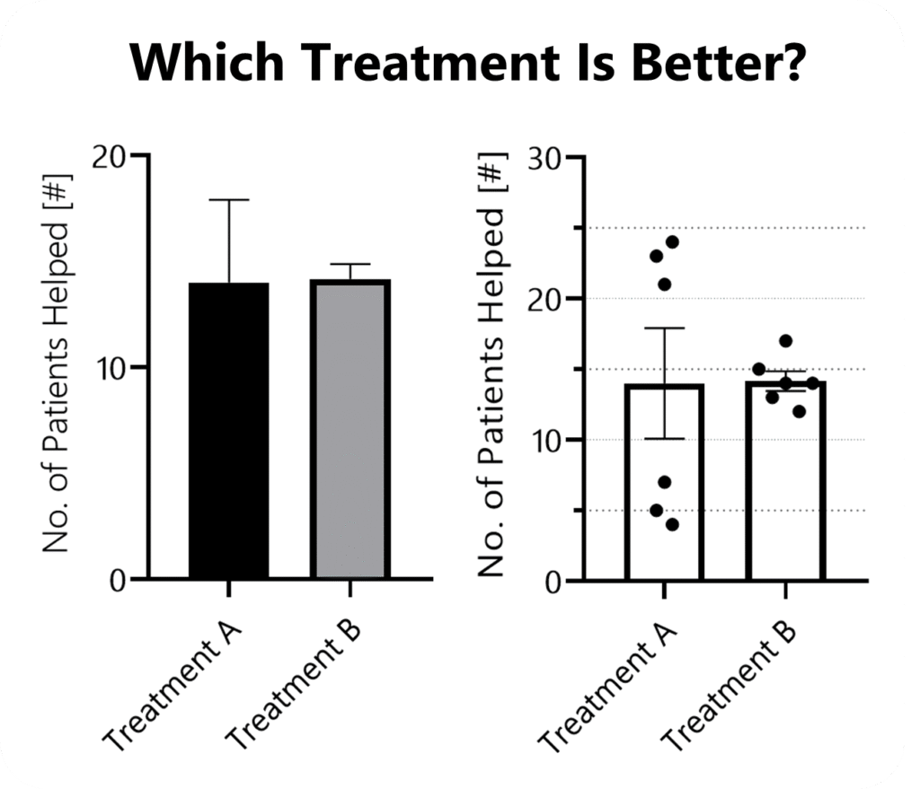
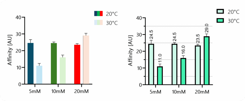
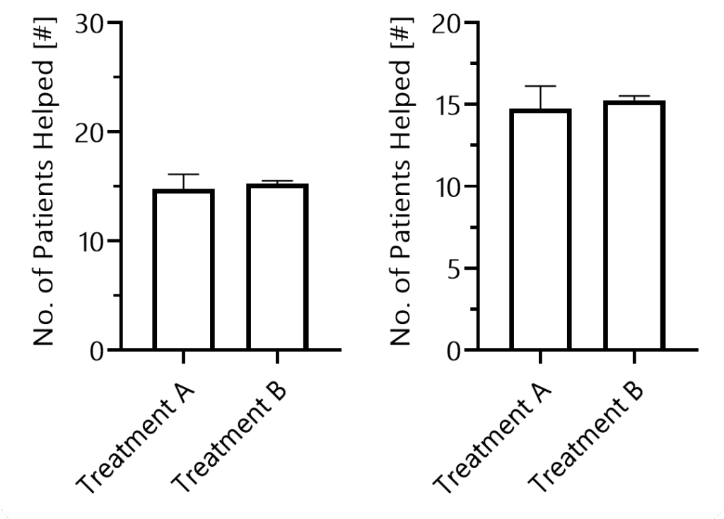
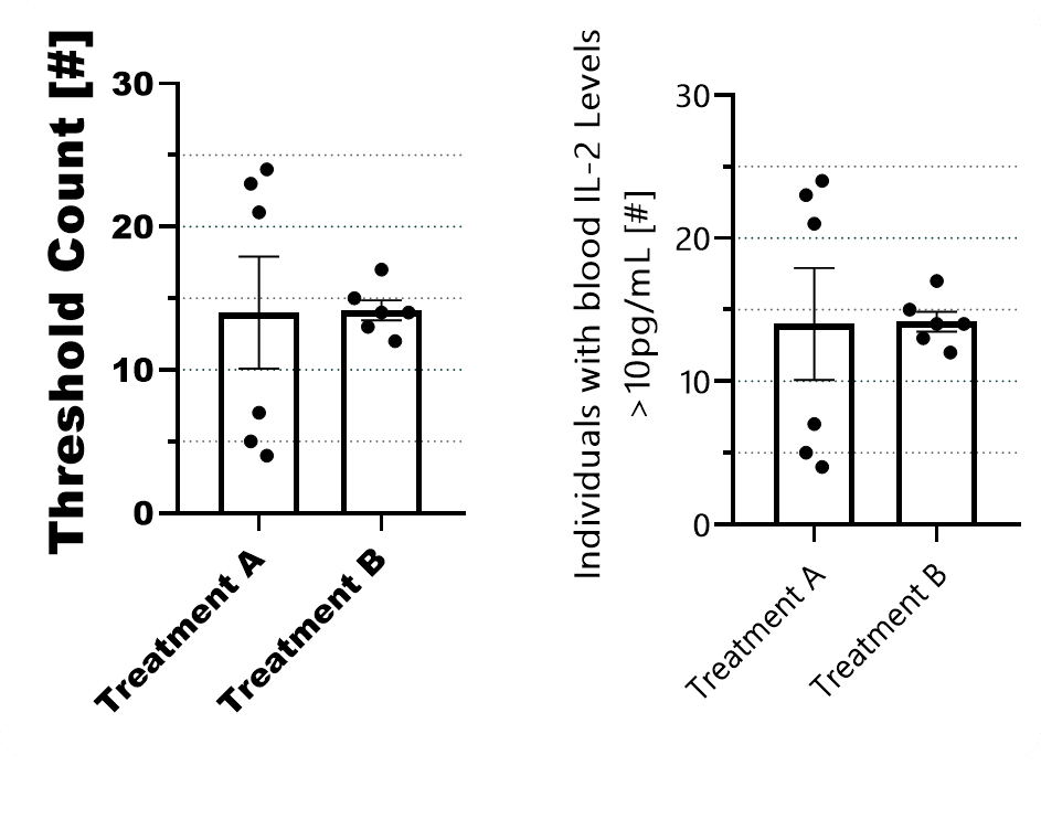
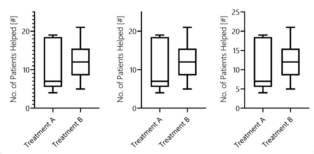
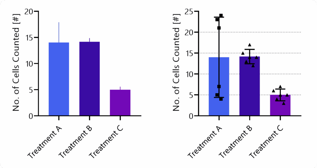
Imagine that six clinical trials, each with 30 participants, were conducted. If you only had three minutes to read the entire paper, it is unlikely you would draw the same conclusion when shown the graph on the left compared to the one on the right. Irrespective of the mean, the two populations only become evident in the right figure.
Design also shapes trust. Readers subconsciously judge the credibility of a study by the clarity and professionalism of its figures. Confusing or careless visuals can undermine confidence in otherwise solid data.
Could you reliably tell whether the dark blue bar is higher than the dark green one in the left figure? Nevertheless, the disharmonious choice of colors and the missing borders around the bars suggest that the graph on the left is less “professional.”
Finally, whether in posters or proposals, clear, well-designed graphics are far more likely to capture attention, be understood quickly, and be remembered.
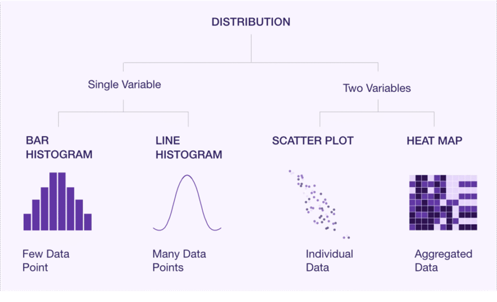
Choosing The Right Graph Type
Most often, we default to those graph types we are used to.
A more scientific approach might be to start by defining the main message of each figure and the order in which information should be presented.
This clarifies what they should convey (and helps to determine their sequence in your paper).
How To Choose
To find an appropriate figure type, you want to ask two questions:
A) Will it display all relevant information? Think
Distribution
Summary statistics such as means (i.e., effects & quantities)
Inferential statistics (SD, CI, or significance)
Inter-sample patterns or comparisons
B) What is visually the easiest to interpret?
What makes differences or similarities most clear?
What guides the eye of your reader?
What can be quickly screened?
Considering Digestability
A good design guides the eye and minimizes how much information the reader has to hold in working memory. Legends are a classic example where smart design can make a big difference.
This example is taken from an excellent overview titled “Design Strategies for Scientific Figures” by the College of Natural Science at the University of Texas at Austin. As a rule of thumb, the faster you can understand a figure, the less mental effort is required.
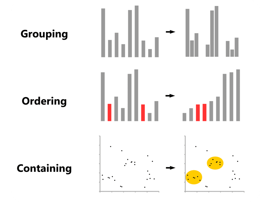
Sometimes, it’s about applying principles of visual composition that help readers grasp information quickly:
As outlined by Aiora Zabala in “Designing More Effective Scientific Figures” (VTP Graphic Design, Cancer Research UK), grouping, ordering, and containing can help readers analyze data at a more hierarchical level and therefore process it faster.
Knowing Which Graphs Exist
After decades of research, new graph types are still getting “invented”.
However, even the fundamentals are not always properly taught in university. Therefore, here is some helpful resources:
Ardigen provides a nice walkthrough of the graph types available and also offers a clear overview that you can keep or turn into a poster.
Luzmo provides a solid overview of the basic chart types you should know.
Atlassian compiled an almost exhaustive overview, with more in-depth explanations of each chart type.
And Datawrapper offers a clear overview along with practical design tips. PS: Make sure to check the small “Example” and “How To” links at the end of each paragraph. For instance, you can dive deeper into when to use area charts or learn how to turn donut charts into bar charts.
The Data Visualization Catalogue also has a helpful search page where you can look up suitable graph types based on what you want to display.
Core Design Principles
Axis Dimensions
Once you compiled your data and chosen a figure type to display it, double-check whether your statistics program automatically chooses the range of your y-axis.
If your y-axis range is too large, differences between groups become visually harder to see, potentially misleading your audience.
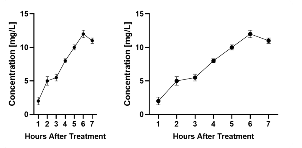
Next, think about the dimensions of your graph in terms of the x-axis. Make sure your readers can visually assess all data points quickly.
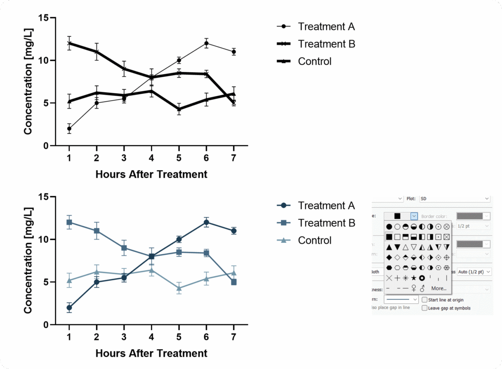
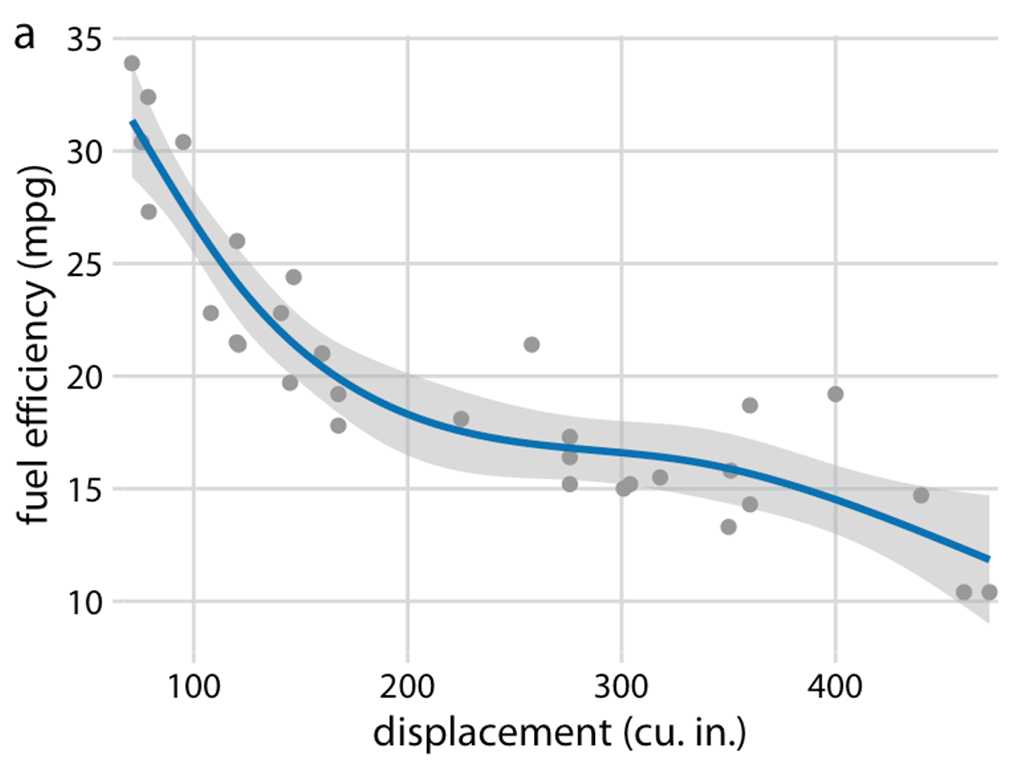
When it comes to curves, consider that the spacing of your x-axis has an important impact on the perceived slope of your graph. Again, there is no way around this. Also consider that the perception of your error bars will vary with the size of your graph. In both cases, mean values ± SD are displayed.
If you squeeze them too close together, it will become difficult. If you stretch the axis too long, it becomes harder to compare data points and differences.
Axis & Data Labels
Your axis labels should allow readers to immediately understand what is being displayed – even without reading the description or main text.
This is especially important because many readers simply scroll through figures to judge relevance.
Pay attention to where you place your legend when you have large panels. Don’t underestimate how long it feels when your eyes have to travel across several charts just to double-check the legend.
In complex setups, it can be helpful to add an additional panel showing the experimental setup.
Axis Ticks
When defining axis ticks, aim for clarity rather than minimalism or maximalism.
Ticks should help readers understand where bars or data points lie.
Line Thickness & Patterns
An often overlooked topic of utmost importance is line thickness. Several scientists might not even know that they can edit it in most software.
When using bar graphs you can choose patterns. But be careful, avoid overwhelming your reader.
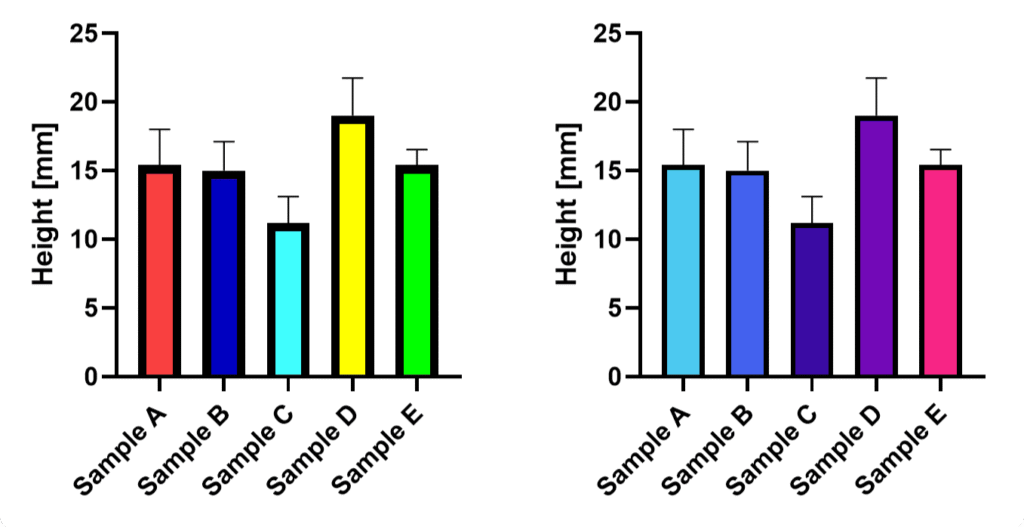
When patterns don’t fit, consider differentiating through color – since we live in 2025, you don’t need to worry that your figures will be printed in black and white.
Color Harmony
One major issue is that we often believe we can choose colors arbitrarily.
But colors strongly influence how data is perceived. And without other supporting graphical elements, we cannot simply “overcome” biasing color.
Rainbow color schemes, for example, draw attention unevenly, and distract the eye. Light tones such as bright yellows are more difficult to see.
How statistics are displayed is critical to scientific accuracy – often as important as the analysis itself.
Effective visualization rests on two principles: show as much relevant information as possible (for example, individual data points), and avoid biasing the viewer through design choices.
Poor or selective presentation can mislead, especially when the presenter has a preferred interpretation. The goal is to let readers draw their own conclusions.
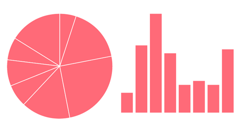
Ever wondered why you normally don’t see pie charts in scientific publications? Because they are suboptimal to read. A bar chart is much better for that purpose. This website has an amazing “game” that tests your ability to analyze different graphs.
Statistics should be clear and informative but visually secondary, supporting the data rather than dominating it.
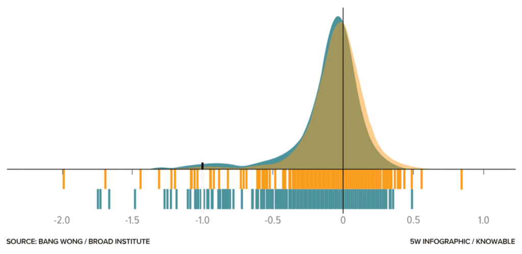
Adding information such as a barcode graph can help leverage the specific advantages of a given visualization technique and thereby allow the reader to gain a better understanding of the data.
The graph above taken from this blog shows the dependency of cell lines on the gene FOXA1 – those to the left of the minus-1 reference line require the gene to survive. Note that for lower frequencies of cell lines, the barcode graph is advantageous, whereas for high densities, the bell curve excels.
Subtle design choices, such as lighter colors and thin lines, help communicate information without distraction.
This is what I mean – the confidence bands make the graph more informative while also improving its appearance. More about such tweaks in this amazing blog.
And still, at some point, design and statistical expertise mix.
For instance, imagine we have to decide which variability measure to show. In bar graphs, you typically choose one of the following: standard deviation, standard error of the mean, or confidence intervals.
Remember, many scientists do not clearly understand the differences, and even fewer take the time to check which one is shown.
A Final Takeaway
OK, so how do you design figures properly?
What is the key message(s) of this figure?
Which data or samples do you need to show, and which statistics should you include?
What is the right graph type (e.g., does it properly show the data distribution)?
Which settings fit your data—should you show individual data points? What line thickness and tick frequency are appropriate?
Choose colors wisely and keep them consistent throughout your paper and across samples.
If you follow these five steps, your figures will look better than the majority of those printed in papers.
Bonus: When designing figures for presentations or posters, it is acceptable to leave out some samples and use larger labels or thicker lines. Again, put yourself in the shoes of your viewer!
Did you like this article?
I share even more detailed insights and cover additional topics such as designing posters or graphical abstracts in our weekly educational series.
An AI research assistant for literature discovery and exploration. It helps you find relevant papers, extract key insights, and plan your own experimental strategy.
An AI for data analysis and visualization. You can upload datasets, ask questions in written form, and generate statistics, graphs, and insights without coding.
An AI tool for reading and understanding scientific papers, although it also offers several agentic work modes that allow you to perform a number of other tasks.
ChatGPT 5.2, with its advanced reasoning, is one of the best-performing AIs – across all functionalities. In other words, every other specialized AI tool had only marginal advantages.
Although it provides less user guidance, it offers the greatest flexibility given that it works with written prompts.
That means if you only want to use a single tool, this is it.
Literature Review and Paper Discovery Tools
Literature review tools are designed to help researchers quickly find, filter, and understand scientific papers. They search large academic databases, summarize key findings, and highlight relevant studies. These tools are especially useful for early-stage research, systematic reviews, and exploring unfamiliar topics.
When to use: Amazing functionality that can save hours of work. Furthermore, it can unearth papers that would stay hidden through normal Google searches.
Main limitations: One cannot be sure whether a search was exhaustive. Moreover, caveats such as differences in the interpretation of results or methods made by humans cannot be corrected by AI. Therefore, a literature search can only be as robust as the underlying science.
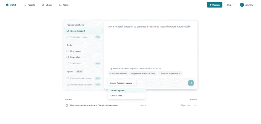
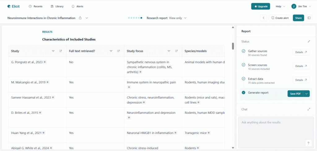
Based on written prompts, Elicit allows for the creation of literature reports, finding of papers, or using “paper chats” to explore single publications. It can present information in different formats, including text summaries and tables, which makes it easier to compare studies quickly.
Yes, I know, how can I not use AI tools in dark mode … And I also know about the inofficial definition: only if it has a dark mode it is a real AI tool 😀
One useful feature is its ability to refine vague or poorly phrased prompts for higher efficiency.
However, it’s not always clear how comprehensive the search results are – whether there would potentially be more papers that simply weren’t caught or analyzed.
When searching for less-researched topics, even with filters like “animal studies only,” the tool often returned many irrelevant papers, despite being labeled as irrelevant.
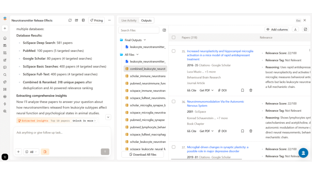
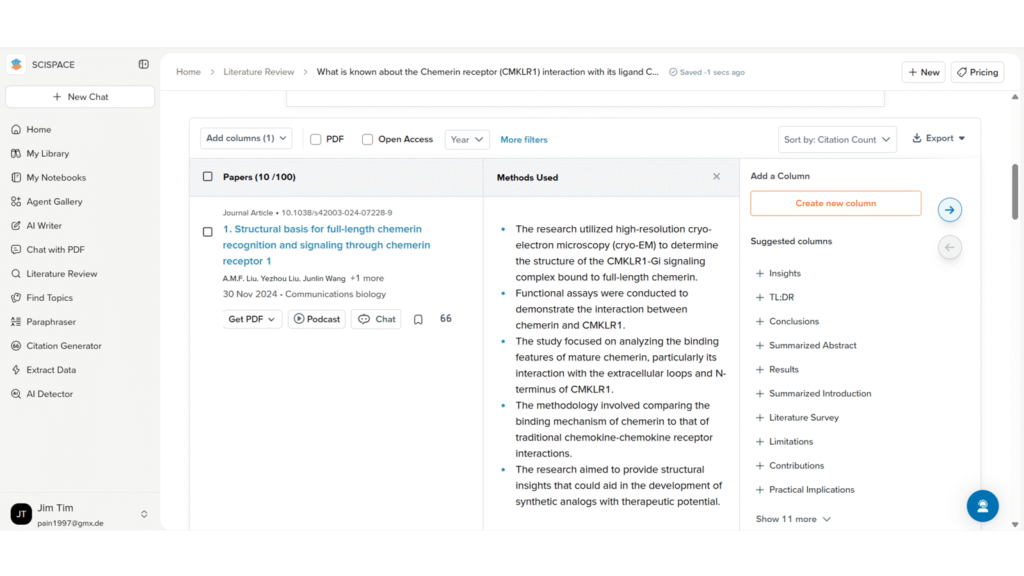
SciSpace’s deep research mode can retrieve a large number of papers and assign relevance scores. The ability to manually browse through all of them is helpful for more systematic reviews.
Moreover, the information is displayed in well-structured and interactive tables.
The main drawback is that free credits are used up quickly. Also, when attempting complex tasks, such as creating a detailed PowerPoint presentation, the system can overload and fail to complete the task, making it frustrating to use for larger projects.
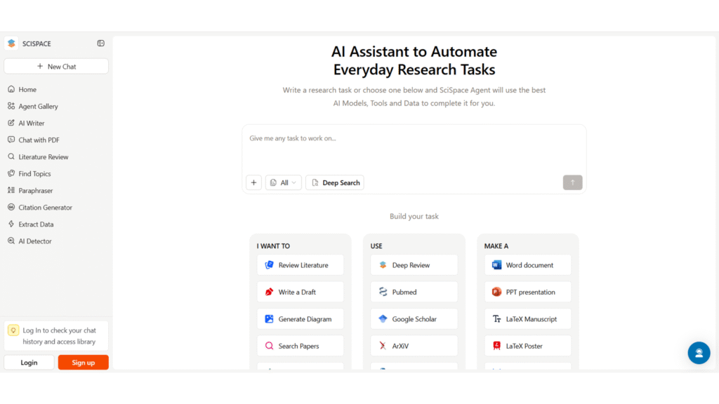
Of note: SciSpace offers several functions beyond basic literature search, such as graph design or text generation.
However, the limited credits remain a limitation, and its functionality in these areas didn’t seem superior to other tools. Still, its real-time suggestions to improve prompts, especially when switching between different features such as search, writing, and presentation tools, can be very helpful and time-saving.
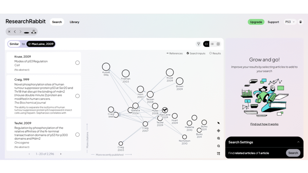
Research Rabbit focuses on finding similar and citing articles. It visualizes connections between papers in a network-style map, which can be helpful for exploring how research topics are linked, which papers influenced others, and which studies are closely related.
In theory, this can be helpful for identifying key papers in a field and understanding how ideas have developed over time.
In practice, however, the search function does not always work very well. Even when the tool indicates that thousands of similar papers exist, it only shows a small number of them.
Very similar to Research Rabbit, Connected Papers shows related research articles in a visually appealing connection map based on the Semantic Scholar database.
It is quick and easy to use, and the visual layout helps users understand how studies are linked.
However, some papers found by the search engine are not included in the map, and for broad topics, the retrieval is still suboptimal.
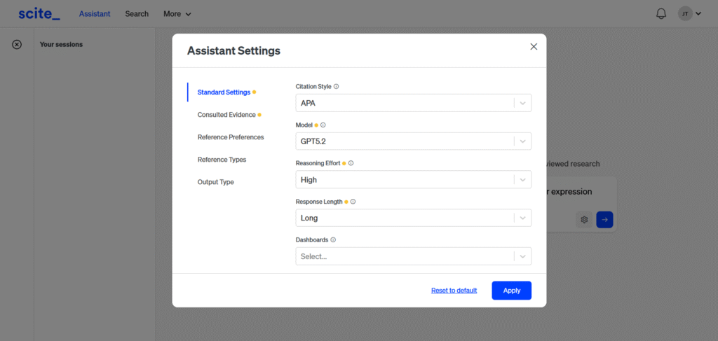
Scite provides standard literature search functionality and shows how papers are cited in context. Compared to ChatGPT alone, it tends to stay more focused on the specific question being asked.
However, it is not very exhaustive, and its scope is narrower. While it avoids overly broad answers, it also misses a lot of potentially relevant literature.
Personal Tip: AI-generated literature summaries will reflect the biases (e.g., overinterpretation of data), ambiguities arising from imprecise definitions (such as what qualifies as chronic stress), contextual dependencies (for example, statistical significance versus biological relevance), and even the errors present in the original papers themselves. Apparent coherence or authority, whether in the literature or in AI-generated outputs, does not guarantee completeness or accuracy.
Therefore, reviewing your prompt strategy (e.g., what is “short term?) as well as vigilance is important. It is easy to get mislead when a summary is based on a single (or a few) studies and miss an important factor, such as an alternative receptor, a splicing variant, or an environmental variable that is simply not mentioned.
AI Research Assistants and Scientific Reasoning Tools
While these two tools are able to conduct literature searches, instead of providing an overview, they are more focused on finding answers to specific inquiries, explaining scientific concepts, and discussing limitations or experimental design. They are strong at reasoning through complex questions in clear language and can provide context that goes beyond simple paper summaries.
When to use: You want feedback or need specific literature for an experimental approach. These tools help you find anything from antagonists to appropriate time points.
Main limitations: You have to double-check – although their output is often precise, it might stem from a paper with a different scope or experimental setup. Moreover, don’t give in to the perception that conducting the experiment will be easy or come without surprises.
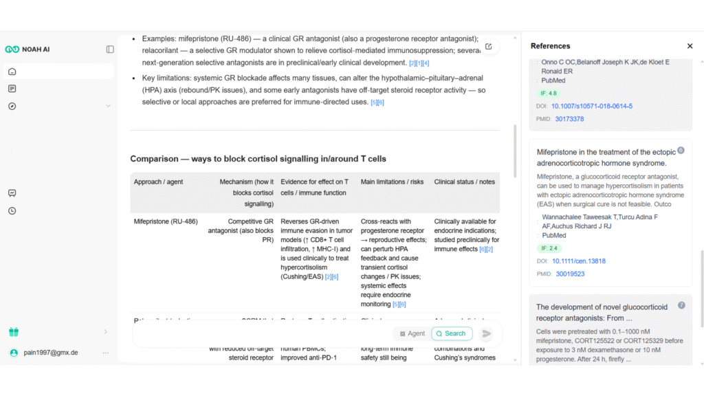
Noah AI performs very well for scientific questions, even when they are nuanced. It provides clear text explanations, tables, highlighted limitations, and even practical details such as concentration ranges, statistical considerations, and appropriate cell seeding densities.
It also allows for long, detailed research outputs with a high token limit, which makes it useful for in-depth scientific exploration.
The main weakness is the unstable interface, which hides labels on the main screen, requiring “experimental clicking” if one wants to use other tabs or additional functionalities. Hopefully, this will be a quick fix for the web designers.
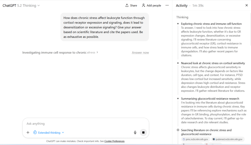
In essence, ChatGPT can help you calculate statistics, create a research plan or find relevant paper.
Overall, ChatGPT performs well in terms of reasoning and explaining complex topics in a structured way. It is also good at discussing limitations and caveats.
While other tools are specifically trained, ChatGPT sometimes has to be re-prompted to obtain additional or more nuanced information.
However, it is not exhaustive in its literature coverage. Moreover, sometimes a different prompting strategy or starting a new chat is necessary to avoid stereotypical answers.
Data Exploration and Visualization Tools
Data exploration, visualization, and design tools support you in turning data and ideas into clear visual outputs. Additionally, they can help you explore datasets, quickly generate graphs, and receive basic explanations of trends, including significance tests or suggestions for suitable visual formats.
When to use: They are fantastic for beginners – they allow you to get a fast overview of unfamiliar data, find trends, and draft visualizations. Especially for those who do not have a knack for statistics, they can be extremely helpful.
Main Limitations: Large datasets with nuances will still require human judgment. Moreover, designed graphs are rarely publication-ready – at best, you can use them for presentations or quick communications. Take care not to share sensitive information or unpublished work, as data may be processed and stored on external servers.
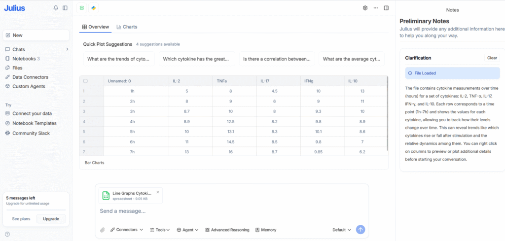
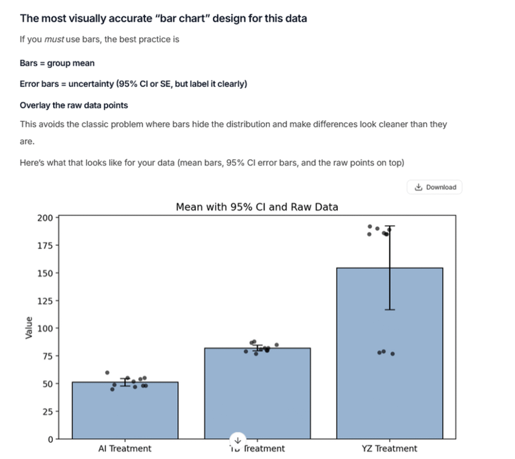
Julius AI is particularly good for basic data exploration. It quickly provides insights into data interpretation, clear text explanations, and generates graphs.
Along with correctly identifying statistical nuances and appropriate tests, it can really lay the foundation for data analysis. It also suggests visually appropriate bar chart designs, which helps avoid misleading visualizations.
While it can modify graphs upon request, for publication-ready designs you will still want to use statistical software.
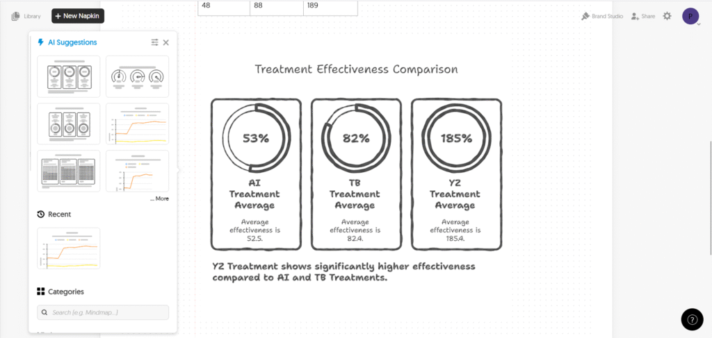
Napkin AI is well suited for creating diagrams and creative visual content that can be used in presentations, posters, blogs, or internal communications.
While you can draw charts or upload your data, it does not analyze data and is not designed for statistical or scientific work.
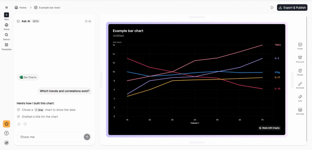
Graphy is mainly a design-focused tool for creating modern-looking charts. While the visuals are appealing, it does not provide meaningful data analysis, and the AI features are not very robust.
It is better suited for presentation design than for scientific interpretation.
Datawrapper is useful for quick data visualizations. It does not include advanced AI features, but its simplicity makes it fast and easy to use.
The downside is that customization options are limited.
Grammar and Writing Tools
Writing-focused tools aim to improve language quality, correct grammar, and sometimes rephrase content. They are mainly useful for polishing manuscripts or refining notes. Some offer functionality to formulate text from bullet points, check for AI-generated content, or detect plagiarism.
When to use: Generally, grammar correction tools are very useful for science students and non-native English speakers. These tools only seem useful if you want a quick add-in for Word; otherwise, use ChatGPT.
Main Limitations: Overall, functionality and performance are rather disappointing. In almost all cases, ChatGPT performs better. Take care not to share sensitive information or unpublished work, as data may be processed and stored on external servers.
In terms of performance, it works reasonably well for grammar correction, but doesn’t offer any convincing functionalities other LLMs couldn’t perform.
While it can save time because it is integrated into Word, its features are rigid, and functions like the title generator perform limited and sometimes poorly.
Its specialized grammar tools perform relatively well. The journal finder, while an interesting feature, is very limited, and overall functionality is quite narrow.
Tools for Specific Analysis Use-Cases
The following tools are not mere add-ins or online software interfaces; they require some amount of coding or extra effort to run locally. However, they demonstrate that for specific use cases, AI tools can make analyses much faster and more functional.
A genomics AI tool from Google that uses deep learning to call genetic variants from DNA sequencing data. DeepVariant treats sequencing reads like images and classifies sites as variant or reference, often achieving higher accuracy than traditional algorithms.
Large Language Models
There are also several large language models trained specifically on biomedical literature (e.g., PubMed abstracts and papers). For example, BioGPT is designed to answer biomedical questions and generate text in a scholarly style. However, these models often need to be run locally or integrated into Python workflows.
Grant Writing Tools
Of course, there are also grant-writing AI tools available. While most of the writing is still up to you, tools like Grantable or Grant Review AI can help you write more efficiently or, in the latter case, provide feedback that is similar to real grant reviews.
Offers antibody search for academic scientists and pharma target verification and research for enterprises.
Enterprise Solutions for Companies and Large Scale
For those of you who work in companies, plan a spin-off, or have larger capacities, there are several AI options available (only) to enterprises. Obviously, these come with a price tag, but they often include personal support and more advanced models.
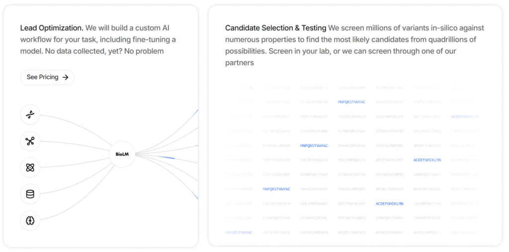
Used for molecular lead optimization. It provides custom AI workflows, including model fine-tuning.
For example, it can screen millions of variants in silico against numerous properties to identify the most likely candidates from quadrillions of possibilities.
A cloud-based image analysis platform that uses AI (deep learning) to help pathologists and researchers analyze microscopy images (e.g., histology slides and tissue samples).
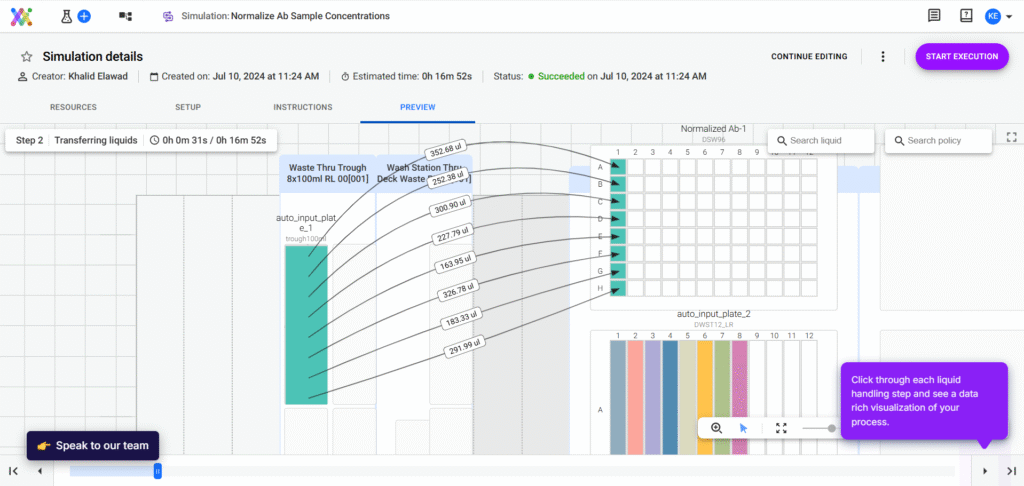
Allows you to design complex, robot-automated workflows yourself. It helps you keep an overview of complex processes, speed up and automate liquid volume calculations, and plan new workflows.
A platform for automated machine learning (AutoML) that can be applied to scientific datasets. DataRobot can ingest data (omics tables, clinical data, etc.), test many modeling approaches, and output the best predictive models without the user needing to code.
A transformer-based, multimodal AI model that integrates multi-omics data—including proteomics, RNA sequencing, and DNA methylation—across multiple species, tissues, and cell lines. It supports tasks such as aging research, disease modeling, drug discovery, and synthetic data generation. It can both synthesize and interpret complex biological data from diverse experimental settings.
And Many More
Of course, you will also find several solutions that combine or specialize in the functionalities of other tools. To name a few examples, Pandaomics BigRNA focuses on predicting detailed RNA regulation (such as splicing and polyadenylation).
Other companies offer AI solutions that help you process your data, such as IBM’s AI agents that integrate with your existing data and applications.
Final Word & Explanation
I hope this overview will prove useful to you.
I was truly surprised by the statistical accuracy and experimental design capabilities.
The literature review tools will certainly prove helpful, especially when starting a new topic or wanting to dive deeper into a hypothesis.
My biggest surprise, however, was the grammar and writing tools. I was genuinely concerned that they would pose a big temptation, especially for young scientists.
In reality, they proved to be far inferior to ChatGPT. In other words, while LLMs can truly enhance grammar and flow, the basic structure and content of a good article must still come from a human.
Part of the reason why some of the tools performed so poorly is that they simply leverage ChatGPT as an input. In other words, behind the buttons you click, they just forward a prompt to ChatGPT and print out its answer.
However, since these prompts are often general (not adapted to your specific use case) and sometimes use older ChatGPT versions, the output is simply poor.
Please also remember that I tested these tools with a limited number of prompts and tasks. If you use them, you will surely find other shortcomings or use cases.
Moreover, I used the free versions, as you probably will initially too. The paid versions often provide unlimited access, advanced setting options, and, especially for review tools, a larger number of studies included in reports.
Still, keep in mind that there are other tools out there that I couldn’t include here, and we continuously see new ones being added.
In my opinion, AI tools can already help you significantly with literature, analysis, and grammar tasks, but they remain just that: tools. No AI will do the work for you—whether it’s experiments, thinking, or writing.
The laureates Mary E. Brunkow, Fred Ramsdell, and Shimon Sakaguchi uncovered a crucial process in our immune system: it’s not only actively fighting infections but also features a suppressive side to prevent overreactions.
This discovery answered one of immunology’s most persistent questions: How does the immune system kill without destroying us?
This question is important because about 5–8% of the world’s population is assumed to suffer from autoimmune diseases.
It was known that autoreactive immune cells are eliminated right after generation. However, it was unclear how the rest of our immune system would be tamed – especially after an infection was over, or when immune cells encountered the ever-present bacteria inside us.
> The recipients found that specialized cells, called regulatory T cells (Tregs), actively suppress immune activation.
However, the path to this discovery led through irradiated animals, extensive genetic mapping, and even the pursuit of cells that turned out not to exist.
Here is why this discovery is so special and how it was made:
A Shift in How We Saw the Immune System
For decades, immunology emphasized attack – antibodies, immune cells, and inflammatory signaling.
Especially antibodies received a lot of attention.
They became the central focus of immunology in the 20th century because they were detectable, measurable in blood, and could be directly applied in medicine – from transfusions to organ transplants and later diagnostics and therapies.
The B-cell puzzle
After several genetic studies, it became clear that B cells generate countless different antibodies through a genetic process called V(D)J recombination, which mixes and matches gene segments to create millions of unique antibody receptors.
This is the complexity of the MHC regions – this review dives deeper into the basics of immunology.
This randomness explained how our immune system could recognize virtually any pathogen – but it also raised a paradox:
If this process is random, why doesn’t it constantly produce antibodies that attack our own tissues?
Central vs. Unknown Tolerance
What scientists soon discovered was what we now call central tolerance.
This mechanism operates primarily in the thymus, where newly formed T cells are tested against the body’s own antigens. If they recognize these “self” molecules too strongly, they are destroyed – a process called negative selection.
But this system isn’t perfect – and that’s where the problem begins.
Some potentially self-reactive T cells escape deletion in the thymus and circulate in the bloodstream. Moreover, why was it that some patients had overshooting immune responses while others didn’t?
A Wrong Idea
In the 1970s, scientists proposed the existence of “suppressor T cells,” based on experiments showing that certain immune cells could inhibit immune responses.
But the evidence was inconsistent, the methods were unreliable, and researchers lacked molecular markers to distinguish these cells from other T-cell types.
Even worse, genetic studies later revealed that the supposed mouse gene linked to suppression (the “I-J locus”) didn’t actually exist.
An interesting historic review – a bit technical at times but providing an excellent comparison of how these original findings map onto Tregs.
As a result, the concept of suppressor T cells was abandoned, and the field of immune suppression fell into scientific disrepute for nearly two decades.
The First Nobel Breakthrough
It wasn’t until Shimon Sakaguchi advanced how we think about immune regulation in 1995.
He identified a distinct population of CD4⁺ T cells expressing CD25, the α-chain of the IL-2 receptor.
When these CD25⁺ cells were removed from mice, the animals developed multiple autoimmune diseases affecting organs like the thyroid, pancreas, and stomach.
When the same cells were reintroduced, autoimmunity was prevented.
This provided clear evidence that suppressive T cells existed – and that they were essential for preventing self-destruction.
A Rodent’s Contribution
The next breakthrough came from an unexpected source – a mouse first observed in the 1940s at the U.S. Department of Energy’s Oak Ridge National Laboratory, during radiation studies from the Manhattan Project.
This mutant, nicknamed the scurfy mouse, developed a severe, systemic autoimmune disease that proved fatal in males.
Decades later, in the late 1990s, Mary Brunkow and Fred Ramsdell decided to uncover the genetic cause behind this strange immune malfunction.
After genetic mapping, they discovered a two-base-pair insertion mutation in a previously unknown gene on the X chromosome. They named it Forkhead box P3 (FOXP3) because it resembled other transcription factors with “forkhead” DNA-binding domains.
You can read the reflection by Ramsdell and Ziegler on FOXP3 and scurfy here. The figure shows ”Structure of the murine Foxp3 gene. You can read more about it here.
The Molecular Key
They could also show that patients suffering from a rare, often fatal autoimmune disorder known as IPEX syndrome had mutations in the human FOXP3 gene – mirroring the scurfy mouse’s disease.
Soon thereafter, Sakaguchi’s team made the connection: FOXP3 is the master transcription factor that defines and controls regulatory T cells. When they introduced FOXP3 into normal T cells, those cells acquired suppressive functions – they had become Tregs.
This was the final piece of the puzzle.
Peripheral tolerance, the counterpart to central tolerance and broader immune regulation in processes such as microbe elimination or wound healing, depends on FOXP3+ regulatory T cells.
The Mechanism of Control
Regulatory T cells act as the immune system’s “brakes” through several complementary mechanisms:
Release of inhibitory cytokines like IL-10, TGF-β, and IL-35.
Induction of cytolysis in other cells.
Vignali et al.(a good overview) and Ge et al.(a more recent and exhaustive review) have written informative reviews on the function of Tregs.
Starving effector T cells by consuming IL-2, depriving them of a growth signal.
Several other mechanisms, such as cell–cell contact with dendritic cells or the release of adenosine, might contribute to their functions as well.
Why the Discovery Was Nobel-Worthy
The combined discoveries provided the missing molecular and cellular foundation for understanding immune self-control.
This work didn’t just explain immune tolerance – it redefined it. It connected basic immunology, genetic discovery, and clinical pathology into a unified framework that now drives new therapeutic strategies.
Ever since then, Tregs have become fundamental in immunological research and teaching.
Today, more than 200 clinical trials are exploring ways to modulate Tregs – from expanding them to treat autoimmune diseases, to selectively disabling them in cancer therapy.
Why Did the Nobel Prize Go To…
Building Truly Versatile Materials
The 2025 Nobel Prize in Chemistry was awarded to Susumu Kitagawa, Richard Robson, and Omar M. Yaghi for developing metal–organic frameworks (MOFs) – materials that combine metals and organic molecules into highly ordered, porous structures.
MOFs are like molecular scaffolds: they have rigid frameworks with vast internal surface areas where gases such as carbon dioxide or hydrogen but also ions, and larger molecules can be stored or react.
Roald Hoffmann once said, “In two or three dimensions, it’s a synthetic wasteland.” The laureates changed that. Here is how:
The Birth of Predictable Frameworks
Richard Robson was among the first to show that one could build extended crystalline networks with precision rather than luck.
In 1989, he assembled copper ions and rigid organic molecules into a diamond-like 3D structure with open cavities – a feat previously deemed impossible by many scientists.
From Fragile to Functional
Susumu Kitagawa advanced this concept in the 1990s by creating frameworks that could adsorb and release gases like oxygen, nitrogen, and methane without losing structure.
Kitagawa also introduced the idea of “soft porous crystals” – frameworks that can shift their shape in response to temperature, pressure, or guest molecules.
This concept redefined solids as dynamic, responsive materials rather than fixed lattices.
The Game Changer: MOF-5
Meanwhile, Omar Yaghi took the field to new heights. In 1999, his group created MOF-5, a zinc-based framework with enormous pores and record-breaking surface area – almost 3,000 m² per gram.
“In 1999, Yaghi constructed a very stable material, MOF-5, which has cubic spaces. Just a couple of grams can hold an area as big as a football pitch.” Read more.
Yaghi then formalized the field through the concept of reticular chemistry – the deliberate linking of building blocks into predesigned networks.
This systematic approach allowed chemists to vary linkers, pore sizes, and functions, leading to families of “isoreticular” MOFs with shared structures but different properties.
Why MOFs Matter
MOFs are now central to materials chemistry because of their unparalleled tunability:
Their internal surface areas can exceed 10,000 m² per gram.
Their pore sizes can be customized to trap specific molecules – from hydrogen to greenhouse gases to toxins.
They can act as catalysts, filters, gas reservoirs, or drug carriers.
Today, MOFs are being developed for carbon capture, clean hydrogen storage, pollutant removal, and even water harvesting in deserts. More than 90,000 MOF structures are now known, and industrial-scale production is already underway.
By making it possible to predict, design, and build porous crystalline materials atom by atom, Kitagawa, Robson, and Yaghi changed how chemists think about matter itself, revealing that even solids can breathe, flex, and adapt.
Written by Patrick Penndorf Connect with me via LinkedIn
For many researchers, the idea of using social media to advance a scientific career can sound like a joke. At best, it’s a distraction after work.
Yet, social media has quietly become one of the most powerful tools in modern communication.
Did you know that cells can actively transfer mitochondria to one another? If you work in cancer biology – this process may contribute to immune suppression.
It’s easy to associate platforms like Instagram or TikTok with viral dances, memes, and silly jokes.
> However, platforms like LinkedIn, Reddit, ResearchGate, and even educational YouTube channels are all forms of social media.
When used strategically, social media enables scientists to amplify citations, connect with peers and build visibility for their work.
Is Social Media For Senior Scientists?
Yes – despite their limited time. In my latest LinkedIn posts, senior scientists represent the largest group of viewers (>37%).
Not only can they discover new inspiration, team members, or events, but they are also a valuable and highly sought-after part of the ecosystem due to their experience. A successful LinkedIn presence can be maintained with as little as 10 minutes per day (and grown with just 1–2 posts per week.)
In addition to conferences, social media is now tge central space where science is discussed, shared, and discovered.
Here are 8 benefits of Social Media – and some tips on how you can reap the benefits that sound interesting to you:
Scientific Advantages
1. Increasing Awareness and Citations
Social media allows you to share your findings with a wider audience. This helps increase awareness of your work, boost citations, and attract future collaborators.
Beyond citation counts, it offers a direct way to amplify the visibility and perceived impact of your research.
How to do it: Share posts about your publications, methods, or new hypotheses. Engage with others by commenting on or resharing related research to stay visible and recognized.
The first step: Create or update your professional account on X (Twitter), LinkedIn, or Instagram. Write one post highlighting a recent project and tag your colleagues and institution.
2. Recruiting Students and Team Members
Social media can serve as an effective recruitment tool.
You can advertise open PhD, postdoc, or technician positions to a broad and relevant audience. This increases your chances of attracting motivated and qualified candidates already interested in your field.
This is from our Trainee Initiative – you can apply right here.
How to do it: Announce open positions. Focus on what makes the role exciting or convey the culture of your lab or team. Tag relevant accounts, institutions, and use hashtags like #PhDPosition or #PostdocJobs.
The first step: Think about what people will enjoy about working in your lab. Identify relevant groups or channels to tag or post in when sharing opportunities.
Advancing Your Science
3. Staying Informed and Connected
Social media helps you stay up to date with developments in your field. New papers, methods, conferences, and discussions on scientific practices are announced there.
It serves as a real-time news source for the scientific community, offering faster and broader updates than traditional channels.
How to do it: Follow journals, societies, and leading researchers in your area. Occasionally engage with posts through likes or comments to help algorithms surface more relevant content for you.
The first step: Identify 5–10 active accounts that consistently share high-quality research in your field.
4. Gathering Input and Feedback
Social media can also be used to crowdsource ideas or gather feedback on research questions.
Posting a well-defined query can attract useful insights from experts worldwide, potentially improving your research design or interpretation.
How to do it: End your posts with clear, focused questions, and tag experts or communities likely to respond. Asking thoughtful questions in others’ comment sections can also help you engage with specialists and gain their perspectives.
The first step: Keep a list of questions that come up during your research so you can share them later. Remember, people will focus on your question itself—not on who asked it.
Although I’m guilty myself of using it too rarely, Reddit is an amazing platform for informal questions. You can find a wealth of helpful and practical tips there – even for very niche topics. Just google the keywords of your question and add “reddit”.
Career Advantages
5. Building a Professional Reputation
Active engagement on social media helps you build a recognizable name in your field. A visible online profile can lead to more invitations to conferences, speaking engagements, and collaborations.
Connect with us – LinkedIn will right away show you who else follows and who might be an interesting connection for you. Moreover, having your posts reposted by us might help you gain reach and backing.
While not the main factor in hiring decisions, a strong online presence can increasingly serve as a valuable differentiator—especially for professorship positions.
A large, engaged following signals visibility, communication skills, and leadership—qualities that universities value as they seek to enhance their institutional reputation and public engagement.
How to do it: Share posts about your current research and occasionally post educational content. Combine your own insights with curated, high-quality content from others. Keep your tone professional but personable.
The first steps: Write a short, clear bio that identifies your research field, current position, and interests. Add a link to your lab website, Google Scholar, or ORCID profile. Starting posting or commenting once a week about your research, teaching, or academic reflections.
6. Promoting Events and Initiatives
If you organize conferences, workshops, or seminars, social media is a powerful tool for promotion. Posting about your events can reach thousands of potential attendees, increasing visibility and participation.
This approach democratizes outreach and enables more inclusive engagement beyond traditional email lists or institutional announcements.
How to do it: Create posts leading up to the event that highlight what attendees will learn and insights you’ve gained during organization. During the event, share live updates or short clips to use the momentum.
The first step: Ask others what they enjoyed about your most (or what they are looking forward to). Then, design one promotional post and schedule it a few weeks before registration opens.
7. Possible Future Importance for Funding
New funding programs – such as the EU Horizon initiatives, which allocate billions for research in areas like cancer and biomes – already require some form of public communication.
Being able to demonstrate influence and reach through followers, engagement metrics, or a strong online presence can strengthen your funding applications, especially for programs that value science dissemination.
Even just posting about your personal achievements is a great way to let anyone “googling” you know what you have accomplished.
How to do it: Identify larger accounts or organizations that effectively communicate science on social media. Similarly, observe how marketing agencies and outreach teams operate. Then, adapt their strategies to your field.
The first step: Find examples of researchers or organizations doing this successfully. Then, learn how to review your social media analytics to benchmark your audience size and engagement rate.
Bonus
An emotional incentive:
Especially on platforms like YouTube and to some extend LinkedIn, it’s not about self-promotion for its own sake, but about ensuring that good science is seen, understood, and valued.
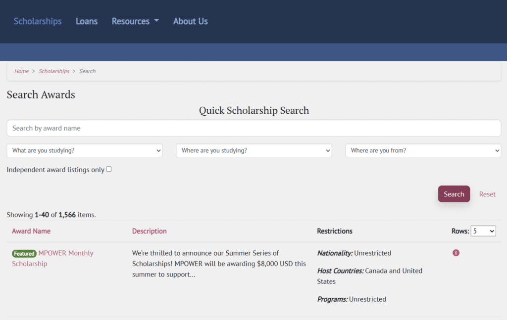
> Still, the next question is: Which scholarship should you pursue?
To explore this, I spent some time browsing different websites to see whether they were actually useful.
My conclusion: yes, they can be very valuable in your search. However, success requires the right mindset.
Let me share the platforms I found helpful, along with some tips on how to navigate them:
Which Platforms exist
Based on my experience, I would categorize these platforms into three types:
Broad – platforms listing scholarships from all over the world
Focused – platforms listing scholarships only in the U.S. or from one specific program or university
Hybrid – platforms that list scholarships alongside loans or travel opportunities
In my experience, most of them cover scholarships across several fields, not just science. That’s not a problem, though, since most platforms provide filters to help you narrow down to your specific field.
Of course, there are many such websites and databases. The key is to find those that are (A) recently updated and (B) enjoyable for you to navigate.
Further below, I share some curcial tips to use these platforms effectively. However, at first I want to give you the list of platforms that I found interesting – along with a short description of what you’ll find there:
Broad Platforms
International Scholarships A simple but practical website. You can filter scholarships by subject, study destination, and country of origin.
Scholars4Dev This site lists a wide range of scholarships. While the interface isn’t the most modern, the detailed descriptions and explanations are a real strength. They not only help you evaluate each opportunity but can also inspire you by showing the different types of funding that exist.
IEFA Scholarships Clear layout with a strong filtering function. You can search scholarships by the region where you want to study as well as your home country.
Global Scholarships The site has a nice design and often links directly to the official program or scholarship pages. However, some information can be confusing or occasionally inaccurate, so double-check details.
Program-Based
Erasmus+ One of the largest funding programs in Europe. Erasmus and Erasmus+ offer a wide range of opportunities for students from and within the EU, covering study, internships, and exchanges.
Country-Based
Scholarships.com A well-organized site with a clean design. It even offers weekly email updates. The main limitation: it only covers scholarships in the U.S.
EduCanada Scholarships If you’re from Canada or want to study there, this is a good place to start. You can filter scholarships by eligibility, though it doesn’t specifically highlight science-focused options.
Campus France The official portal for scholarships and bursaries for studying in France.
University-Based
LMU Munich Scholarships Scholarship opportunities specifically for international students at LMU Munich.
Pathways to Science Focused on opportunities in the U.S., this platform is especially strong for STEM students. It includes not only scholarships but overall resources and program information.
GoAbroad & GoOverseas A broad platform for searching experiences abroad—whether study, internships, or travel-related opportunities.
Bonus
IUBMB & IUBMB TI Many research organizations provide a number of scholarships, so does the IUBMB. Also, the previous IUBMB TI Chair Cathy invited all Trainees to add scholarships from their institutions in order to create a list of trustworthy opportunities. It is still a work in progress, but you can visit it here.
In my opinion, these platforms an easily overwhelm you without the right approach. Here is my experience:
Tips for Handling the Platforms
Most platforms host more scholarships than you will ever be able to apply for.
> Therefore, your mindset is the key factor that decides whether you can get value from any platform.
My number one tip: patience.
If you had seen me during my first searches, you would have laughed (or had a stroke). I’d open a page and immediately click around—“Where’s the filter? Click, click… oh no, wrong tab, scroll up, click back, forward, search again… wait, wasn’t that in the other tab? Open it again…”
I wanted to get things done quickly, just like you probably do. But the better approach is to take a breath and get an overview first. Let’s be honest—what feels like “I will waste hours” usually turns out to be just five minutes if you actually used a stopwatch.
The same applies to taking notes. It feels tedious and unnecessary, but otherwise you’ll end up doing the same search three times because your working memory simply cannot handle all the information presented.
No doubt, not all platforms have the filters you’d wish for, so don’t get intimidated if you suddenly see 76 results. Start filtering step by step. As outlined before: eliminate the ones that clearly don’t fit. Then move on to eligibility, and so on.
My second tip: coolness.
Unfortunately, some platforms will make the task of finding a scholarship seem impossible: words you don’t know, links that don’t work, descriptions that don’t make sense.
Stay cool. No matter how amazing an opportunity seems, it is not the only one. Trust me. And no matter how overwhelming it feels, don’t give in.
Here is what I would advise:
Slang or jargon you don’t know – ask ChatGPT or Google, and keep a glossary of these terms.
Outdated information – always check the program’s official website.
Inaccuracies – for example, some platforms list “Free Tuition” options for internationals as if they were scholarships (they’re not). If something seems odd, just check the entry on another platform or Google it to verify.
It can, and probably will, be frustrating, but remember: the academic system is messy. It’s not always the platform’s fault—sometimes it’s the programs or institutions themselves. For example, I once found this on a German university website:
“There are no tuition fees at the University of Würzburg. But all students have to pay a semester contribution of €168.50 before they can be enrolled (Breakdown: Student Services fee: €72.00 + semester ticket: €96.50).”
So basically, there are fees—just not tuition fees. Fair, but initially confusing.
In essence: Use these platforms as a faster Google. Don’t expect too much, and don’t get FOMO (Fear of Missing Out). In the end, they open the door to endless opportunities that you would otherwise only discover if you searched the website of every single university and scholarship program worldwide.
Written by Patrick Penndorf Biochemist and recipient of the one or other scholarship ; )
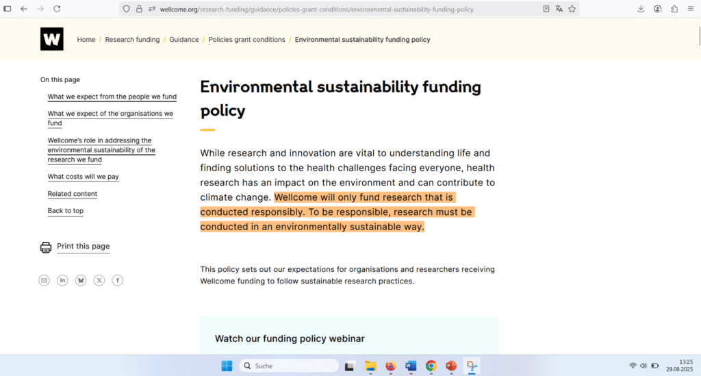
As I visited the webpage of one of the world’s biggest funders, I read:
“Wellcome will only fund research that is conducted responsibly. To be responsible, research must be conducted in an environmentally sustainable way.”
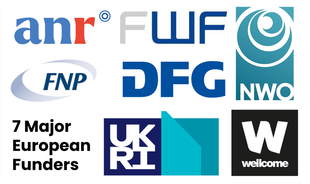
Starting in 2025, Wellcome and Cancer Research UK will only support labs that can prove their sustainability — certified through programs like LEAF or My Green Lab.
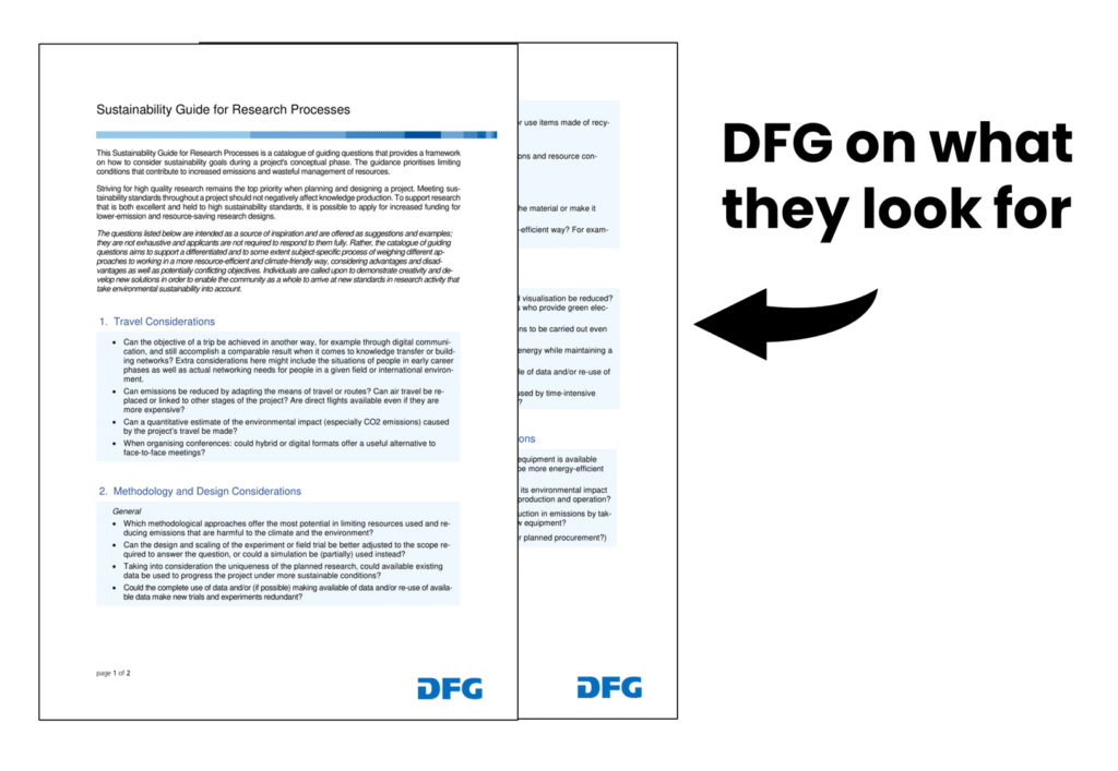
Other funders have followed suit. For example, Germany’s DFG already requires applicants to outline which sustainable practices have been implemented in their labs — similar to the existing requirements for statements on animal use and statistics.
We’ll share the full story in our online summit if you’re interested — but here’s what you need to know:
What Exactly Is Happening
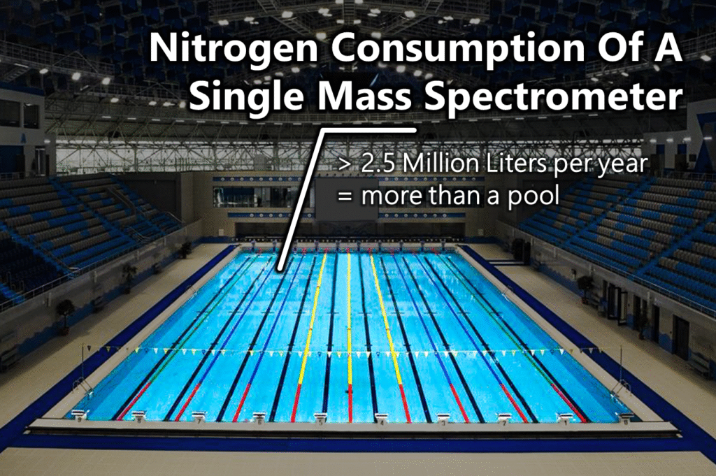
Research is resource-hungry. Globally, labs produce more than 5 billion kilograms of plastic waste and consume over 100 million liters of solvents each year.
You don’t believe that number? You can read more about that topic in this article.
Furthermore, we can estimate that healthcare and biotech together contribute more than 4% of the world’s carbon footprint.
Funders are no longer willing to ignore this. While Wellcome Trust took the bold first step, several other funding bodies have followed:
In October 2024, seven major European funding bodies signed the Heidelberg Agreement, recognizing the role of sustainability in funding decisions.
These seven funding bodies are the Austrian Science Fund (FWF), Dutch Research Council (NWO), Foundation for Polish Science (FNP), French National Research Agency (ANR), German Research Foundation (DFG), UK Research and Innovation (UKRI) and Wellcome Trust.
While funding agencies in the US or Asia haven’t yet implemented similar requirements, we’re seeing progress:
The My Green Lab Certification and the ACT Ecolabel Program have been officially recommended in a joint white paper by the Environmental Protection Agency (EPA), the U.S. Department of Energy, and the University of California, focusing on energy savings.
Thailand Lab International 2024 dedicated an entire session to the topic.
Awareness is growing — and action is on its way.
Do You Need To Worry?
No — because we’re putting together a webinar to help you prepare for these changes, wherever in the world you are.
We’ll show you how sustainability in labs isn’t just about saving the planet — it’s also about saving time, money, and improving safety. Labs often cut 30–60% of their plastic, reagent, and energy use.
And the best part? It doesn’t take much time, effort, or expertise to get started.
Sustainability in labs touches on aspects we all know from our everyday lives:
Plastics and single-use items
Energy and electricity
Water use
Chemicals, reagents, and gases
Instrument use (e.g., freezers, fume hoods)
Waste treatment
Travel
Therefore, the key to navigating this transition is simple: don’t get overwhelmed.
It may seem like a lot, but most changes are simple and straightforward – I give you my word.
My tip:
Collect ideas on what you could improve whenever they come to mind.
Start with easy changes that are quick to implement, no matter how small they are. Early on, taking action is key. For instance, so far the DFG is totally fine with you getting started.
Identify teammates who might join you in driving change. This will add motivation and be critical later on.
If possible, raise the topic in your next lab meeting – often, you will get more buy-in than you might expect.
👉 Bottom line: Sustainability will no longer be optional. Given the growing environmental impact of science, it’s only a matter of time before funding bodies around the world make it a requirement.
Still, properly understood, sustainability essentially means nothing more than generating data more robustly.
> Plus, it’s a smart way to adapt to budget cuts.
If you want to navigate the transition with less stress and time investment, sign up for the online event we put together for you!
Written by Patrick Penndorf Biochemist with +5 years of applied experience in making science sustainable
The key to focusing and creating a good mindset is to set a clear aim and define the path that gets you there.
It’s a little bit like walking over a tree that connects two cliffs. You don’t look down to the left or right — you stay focused on what’s in front of you.
Here’s how to do it:
A) What is your goal?
Clearly define what you motivation is: Do your first piece | Get a lot of clicks | Grow your channel | Test one idea versus another | Try a new technique
Be specific because it helps turn the void in your mind into a sharp picture. You don’t need to worry about creating a viral post if you just want to test a new writing or editing technique. The clearer you are about what you want, the easier it is to ignore everything else. Therefore: one goal only.
B) What is your long-term goal?
Don’t get stuck on making a perfect piece. However, don’t drop your attitude and standards either. Instead, focus on where you want to be.
If you have a larger goal in mind, you will see where you lack skills, experience, or knowledge and still take action — because you know it will get you closer to your goal. Having your final goal in mind will inspire you and make every little misstep or failure along the way feel much less significant.
Ask yourself:
What do you want to be known for?
What videos should be on your channel?
What should the reaction of your audience be?
P.S. Do you notice how envisioning that last point excites you more than scanning for mistakes or obsessing over how to “improve”?
C) What is the first step of each action you need to take?
Just think about the very first action you need to take to get started. This doesn’t mean “turn the computer on.” But rather, “decide on an overall layout” or “gather the papers you want to include before writing the introduction of your manuscript.”
Don’t think about everything at once — just layout (not layout + colors + components + shadows, etc.) or just how to start the introduction (not which writing style + sentence length + transitions). Everything else will come step by step. Break big tasks down.
D) What do you still need?
Sometimes doubt won’t immediately fade even when you know what to do. Then, face your anxiety: What don’t you know how to do? What do you still need (e.g., a list of…, a login for…, figuring out how to upload…)? You don’t need all the answers. But you do need to identify what keeps your mind distracted.
E) What to prioritize
Now that you know where you want to go, how to get there, and what you still need, you can decide what to take action on. Prioritizing is hard for many people. But now you’ve got all the puzzle pieces, which makes it easier.
Ask yourself: What can and should I do first?
F) What’s in your way / What should you double-check?
If you have doubts, make a list of things you shouldn’t forget. Again, taking the first step is most important. A list or timeline will help you avoid losing track of what needs to be done later. The more focused you are on the task at hand, the better.
As a side note: If you are about to give a talk or record yourself, you might think you shouldn’t obsess over the situation — but I’d argue you should go all in. The anxiety comes from not going all in. You’re not focusing on the presentation itself but on what people might think, what questions you might not be able to answer, etc.
G) What will you not be able to control?
In most cases, you have no idea how well you’ll do. Often, our audiences and content vary too much to predict how something will be received. Remind yourself: what others say has nothing to do with your self-worth.
Do not identify yourself with your creation. You work on the piece — your creation gets the spotlight, not you. Your mind is trained to latch onto feedback as a judgment of whether what you did was good or not. Leave that aside for now. If you don’t start, you cannot improve. If you don’t try, you cannot know if you’re sitting on a gold mine. If you don’t launch, you cannot receive accolades.
Bonus
If possible, spend time with positive and happy people before you create content. The joy, motivation, and inspiration you get from those who are productive and upbeat is invaluable.
Before we dive into a powerful strategy for writing a convincing CV, we need to clear up one common source of confusion: the difference between a CV and a résumé.
The Curriculum Vitae
A CV (curriculum vitae) is a detailed, comprehensive record of your professional life. It is often used in academic environments and in medicine. It lists everything: education, work history, publications, awards, conference presentations, teaching experience, and more. Length is generally not an issue; some academic CVs run over 10 pages.
The Résumé
A résumé, on the other hand, is short (often just one page) and highly selective. It’s a targeted application document designed to show why you’re the right fit for one specific job. Instead of listing everything you’ve done, it highlights the most relevant skills, experiences, and achievements for that role.
Aspect
CV
Résumé
Length
No strict limit; can be 2–20+ pages depending on experience.
Usually 1 page for early-career, 2 pages max for experienced candidates.
Scope
Delivering an overview of the applicant and his/her potential; including a complete career history
Summarizing relevant information for quick assessments
Detail
Lists everything – every position, paper, talk, course taught, affiliation..
Selective – only includes experiences that demonstrate qualification for the job at hand.
Why “CV” Often Means “Résumé”
The phrase curriculum vitae has been used since the 19th century in academic and medical circles to describe a formal, detailed record of someone’s professional life. Résumé, French for “summary,” was adopted into English in the early 20th century, especially in the US. It became established and popularized as business culture grew, where employers preferred a quick, focused snapshot rather than a full biography.
Here’s where it gets tricky: trends from the US have influenced hiring language globally. As a result, in Europe or Asia, companies often use the word CV even when they’re really looking for a résumé-style document. In other words, if you submit a 12-page academic-style CV for an industry role, your key points will likely get lost.
Why Brevity Is Key
If you apply for an industry job anywhere outside the US or Canada, you may need to read between the lines to determine whether they want a résumé-like CV — which is very likely. The reason this shorter format is so widely adopted is:
The first screen is fast — hiring managers often take only 20–60 seconds to decide if you move forward.
Relevance beats completeness — your document should show why you fit the role, not everything you’ve ever achieved, especially because business roles are often focused on one function.
Industry values productivity — they care about practical experience and measurable achievements, not publications, presentations, or posters.
What Each Contains
To drive the point home, here’s a list of what a common CV and résumé should contain:
Résumé / Industry CV
CV
Name & Contact information
Name & Contact information
Summary or objective (often only when no cover letter or statement is requested)
Education (all degrees, with details like thesis title & advisor)
Work experience (only what is relevant to the role, achievements quantified when possible)
Academic positions & employment history (including internships)
Education (brief, often only latest)
Publications (books, journal articles)
Skills section (no soft skills, only what is directly applicable to the role)
Grants, fellowships, and awards
Conference presentations and invited talks
Professional affiliations and memberships
Service roles or Volunteering (editorial boards, committees, peer review)
Some Nuances
Academic CVs usually list sections chronologically – earliest education, publications, and positions first.
Industry résumés use reverse chronological order, highlighting the most recent and relevant experience for quick scanning.
That said, even an exhaustive CV in reverse order is unlikely to hurt your chances (it didn’t for me when applying at Max Planck).
A Photo?
In countries like Germany, France, Spain, China, and Japan, professional headshots on CVs are common and often expected.
In some regions, they’re part of standard application culture, though modern non-discrimination rules sometimes discourage them.
In the US, Canada, UK, and Australia, photos are generally discouraged for most roles
How to Create an Outstanding Résumé/CV
Start by avoiding basic mistakes. If you’re applying for an industry position in the US, read the job specifications carefully — and don’t send an eight-page list of every conference you’ve attended.
My top 3 tips:
Focus on relevance. Only include what directly supports your application for this role. Even if you’re an excellent fit, if the hiring manager can’t spot your key qualifications in 10 seconds, you’re unlikely to get an interview.
Dig deep, but don’t be overly creative. If you’ve never worked in industry, you may struggle to list qualifications. Adding related skills can help, but keep your document concise rather than forcing connections that don’t exist.
Show measurable impact. In an academic CV, you can simply list publications or research topics. In industry, back up achievements with metrics: Did you design a complete workflow? Attract a certain number of attendees? Secure funding? Quantify what you accomplished.
> Putting together your first industry application can feel overwhelming — it’s the same for everyone.
That’s why, in our course, we guide you step-by-step through creating a strong résumé/CV. We’ve collected examples and best practices to help you feel confident and save time.