In this article, imagine you are about to publish a paper – perhaps even in one of the IUBMB journals?
While many researchers simply load their data into a statistics program, choose a few colors they like, and export the figure, this approach often produces results that do not look professional and may even mislead the reader.
In other words, the figures may lack scientific precision.
This problem often arises because, at university, we do not learn statistics in depth, nor do we receive training in visual design.
However, both are quite simple to master
We just need to pay attention to a few key concepts. Let’s see how you can create excellent figures in today’s research environment.
TL;DR
This article takes about 5–10 minutes to read. I kept it as concise as possible and cover how to design effective figures by:
- Deciding which data and statistics to show
- Choosing the appropriate graph type
- Adjusting display settings (points, lines, ticks, colors)
- Designing statistical elements accurately
I outline best practices, practical tips, and include a range of exemplary graphs.
Whether you read it carefully or skim through it, both approaches should provide a lot of value.
Why Graphical Design Matters
How data are visualized directly affects how they are interpreted.
= Poor design can hide variability, exaggerate effects, or even lead to incorrect conclusions, making graphical design essential for scientific accuracy.
Design also shapes trust. Readers subconsciously judge the credibility of a study by the clarity and professionalism of its figures. Confusing or careless visuals can undermine confidence in otherwise solid data.
Finally, whether in posters or proposals, clear, well-designed graphics are far more likely to capture attention, be understood quickly, and be remembered.
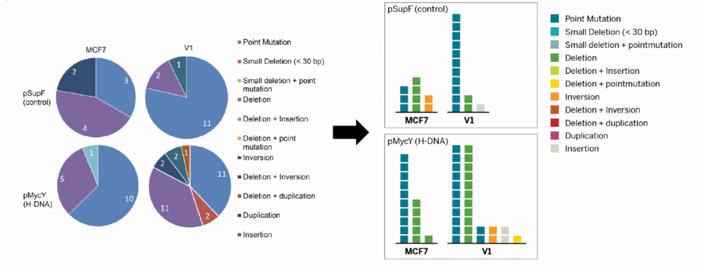
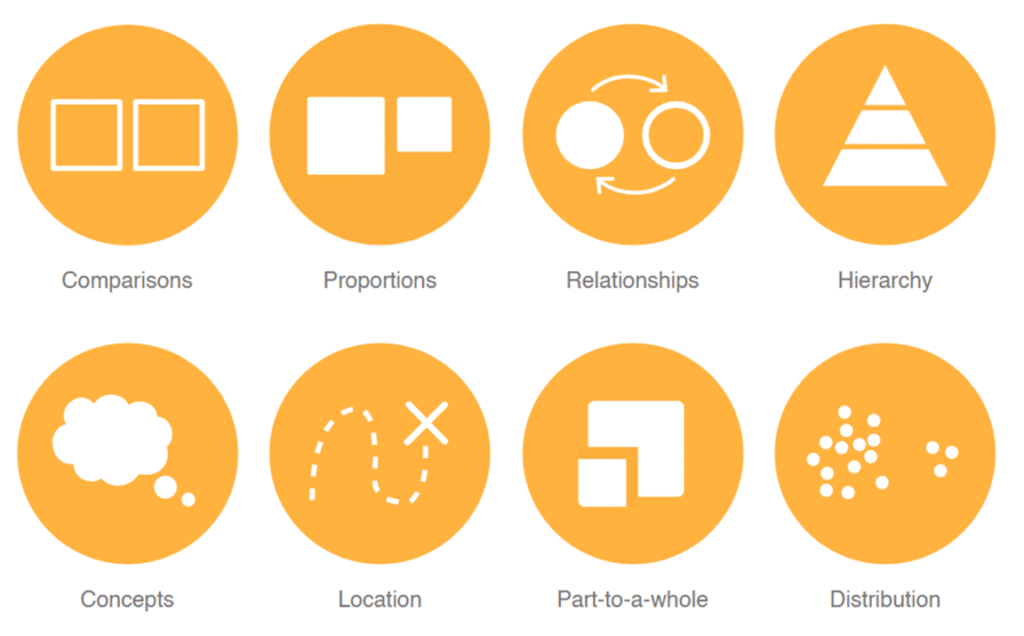
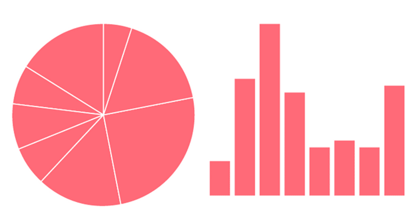
Choosing The Right Graph Type
Most often, we default to those graph types we are used to.
A more scientific approach might be to start by defining the main message of each figure and the order in which information should be presented.
This clarifies what they should convey (and helps to determine their sequence in your paper).
How To Choose
To find an appropriate figure type, you want to ask two questions:
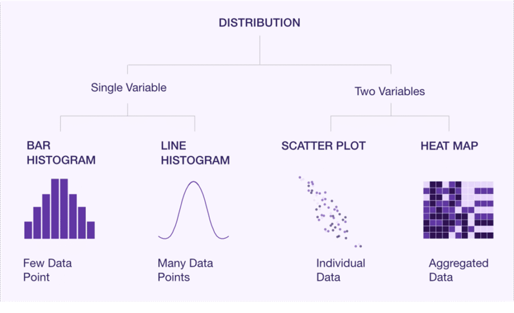
A) Will it display all relevant information? Think
- Distribution
- Summary statistics such as means (i.e., effects & quantities)
- Inferential statistics (SD, CI, or significance)
- Inter-sample patterns or comparisons
B) What is visually the easiest to interpret?
- What makes differences or similarities most clear?
- What guides the eye of your reader?
- What can be quickly screened?
Considering Digestability
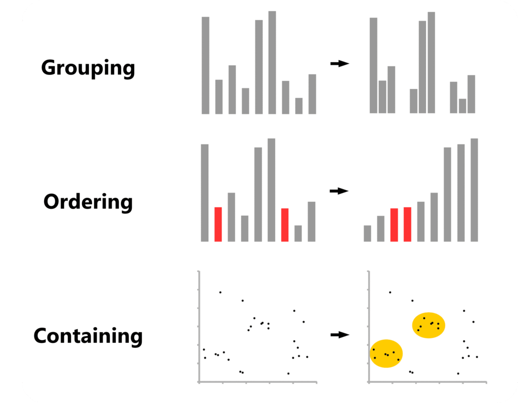
A good design guides the eye and minimizes how much information the reader has to hold in working memory. Legends are a classic example where smart design can make a big difference.
Sometimes, it’s about applying principles of visual composition that help readers grasp information quickly:
Knowing Which Graphs Exist
After decades of research, new graph types are still getting “invented”.
However, even the fundamentals are not always properly taught in university. Therefore, here is some helpful resources:
- Luzmo provides a solid overview of the basic chart types you should know.
- Atlassian compiled an almost exhaustive overview, with more in-depth explanations of each chart type.
- And Datawrapper offers a clear overview along with practical design tips.
PS: Make sure to check the small “Example” and “How To” links at the end of each paragraph. For instance, you can dive deeper into when to use area charts or learn how to turn donut charts into bar charts.
The Data Visualization Catalogue also has a helpful search page where you can look up suitable graph types based on what you want to display.
Core Design Principles
Axis Dimensions
Once you compiled your data and chosen a figure type to display it, double-check whether your statistics program automatically chooses the range of your y-axis.
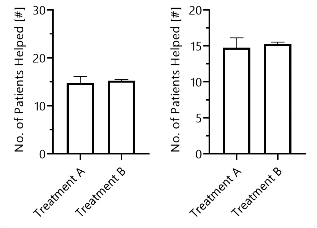
If your y-axis range is too large, differences between groups become visually harder to see, potentially misleading your audience.
Next, think about the dimensions of your graph in terms of the x-axis. Make sure your readers can visually assess all data points quickly.
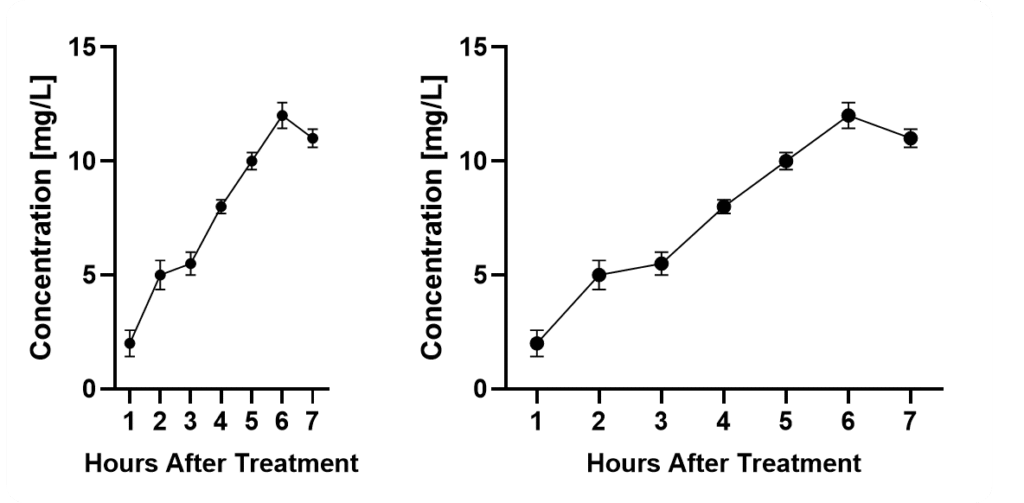
If you squeeze them too close together, it will become difficult. If you stretch the axis too long, it becomes harder to compare data points and differences.
Axis & Data Labels
Your axis labels should allow readers to immediately understand what is being displayed – even without reading the description or main text.
This is especially important because many readers simply scroll through figures to judge relevance.
Pay attention to where you place your legend when you have large panels. Don’t underestimate how long it feels when your eyes have to travel across several charts just to double-check the legend.
In complex setups, it can be helpful to add an additional panel showing the experimental setup.
Axis Ticks
When defining axis ticks, aim for clarity rather than minimalism or maximalism.
Ticks should help readers understand where bars or data points lie.
Line Thickness & Patterns
An often overlooked topic of utmost importance is line thickness. Several scientists might not even know that they can edit it in most software.
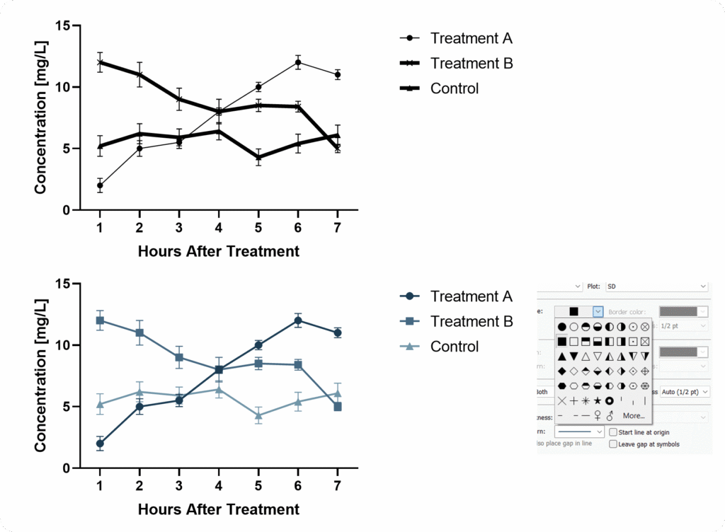
When using bar graphs you can choose patterns. But be careful, avoid overwhelming your reader.
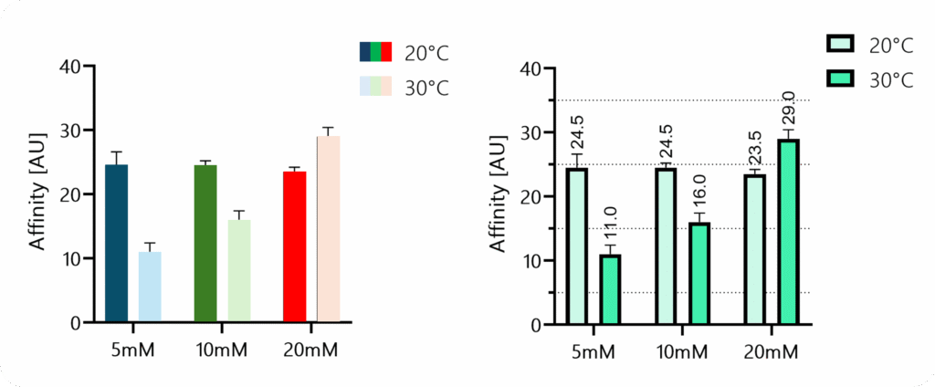
When patterns don’t fit, consider differentiating through color – since we live in 2025, you don’t need to worry that your figures will be printed in black and white.
Color Harmony
One major issue is that we often believe we can choose colors arbitrarily.
But colors strongly influence how data is perceived. And without other supporting graphical elements, we cannot simply “overcome” biasing color.
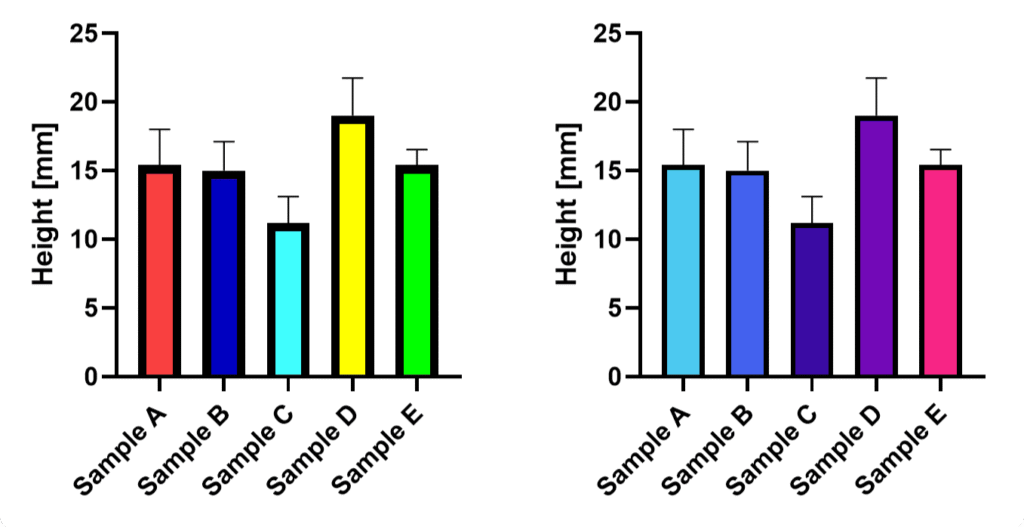
Rainbow color schemes, for example, draw attention unevenly, and distract the eye. Light tones such as bright yellows are more difficult to see.
Therefore, choose a harmonious color palette. We discussed several tools that help with this.
Accounting For Statistics Properly
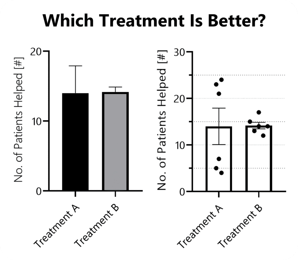
How statistics are displayed is critical to scientific accuracy – often as important as the analysis itself.
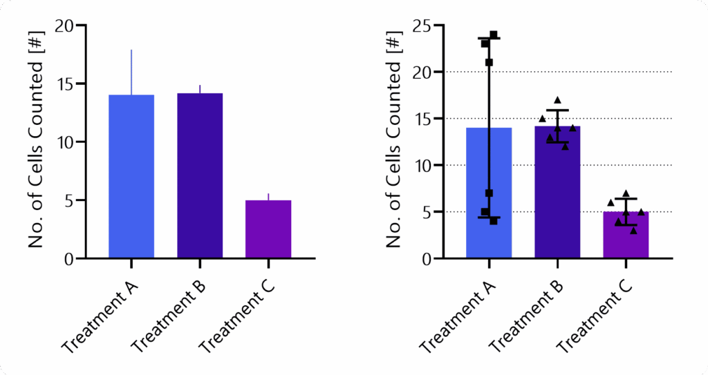
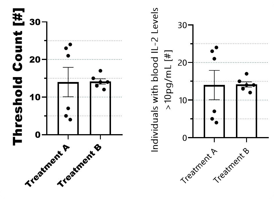
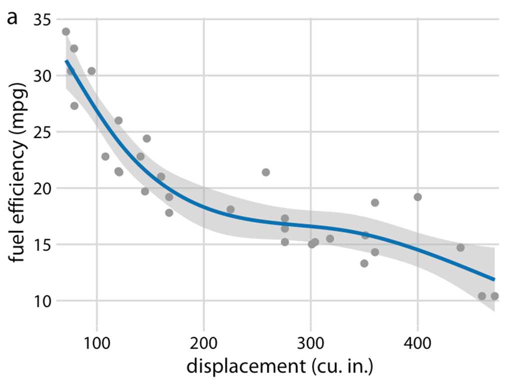
Effective visualization rests on two principles: show as much relevant information as possible (for example, individual data points), and avoid biasing the viewer through design choices.
Poor or selective presentation can mislead, especially when the presenter has a preferred interpretation. The goal is to let readers draw their own conclusions.
Statistics should be clear and informative but visually secondary, supporting the data rather than dominating it.
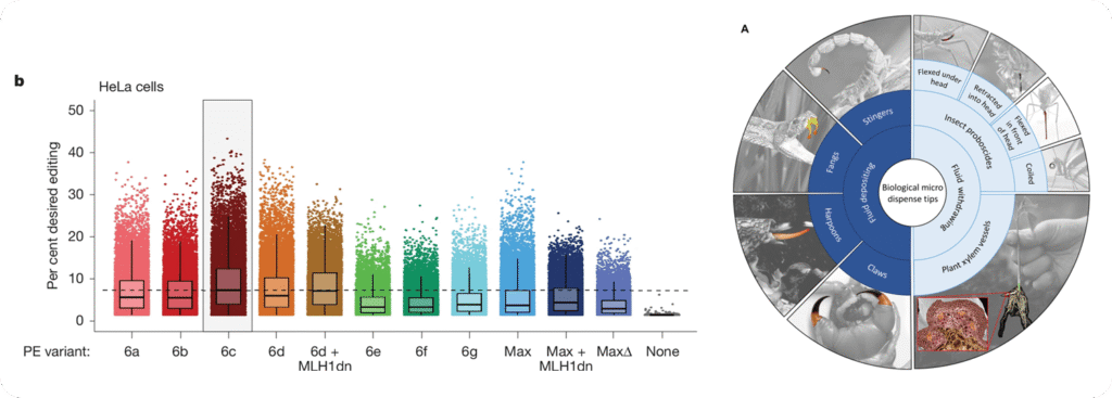
Adding information such as a barcode graph can help leverage the specific advantages of a given visualization technique and thereby allow the reader to gain a better understanding of the data.
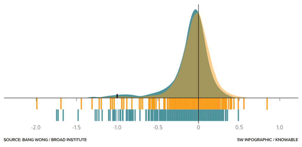
Subtle design choices, such as lighter colors and thin lines, help communicate information without distraction.
And still, at some point, design and statistical expertise mix.
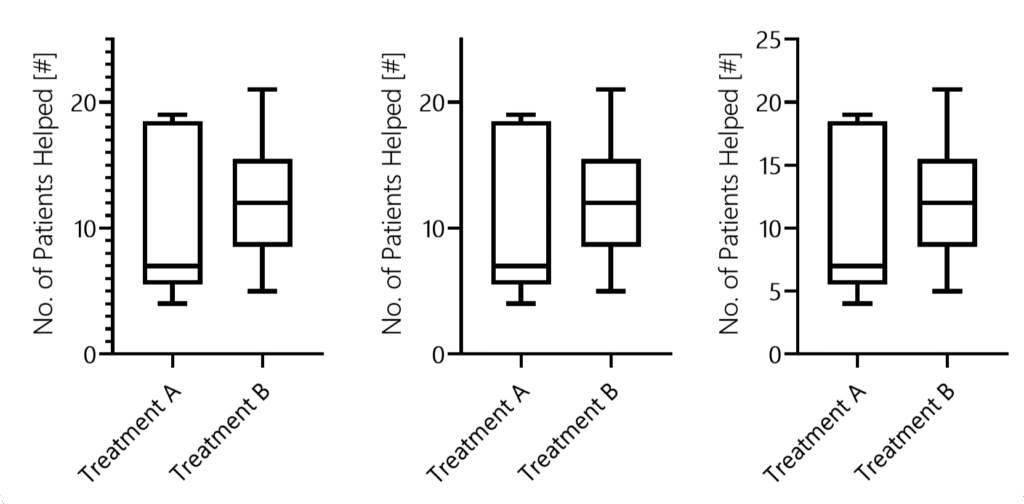
For instance, imagine we have to decide which variability measure to show. In bar graphs, you typically choose one of the following: standard deviation, standard error of the mean, or confidence intervals.
Remember, many scientists do not clearly understand the differences, and even fewer take the time to check which one is shown.
A Final Takeaway
OK, so how do you design figures properly?
- What is the key message(s) of this figure?
- Which data or samples do you need to show, and which statistics should you include?
- What is the right graph type (e.g., does it properly show the data distribution)?
- Which settings fit your data—should you show individual data points? What line thickness and tick frequency are appropriate?
- Choose colors wisely and keep them consistent throughout your paper and across samples.
If you follow these five steps, your figures will look better than the majority of those printed in papers.
Bonus: When designing figures for presentations or posters, it is acceptable to leave out some samples and use larger labels or thicker lines. Again, put yourself in the shoes of your viewer!
Did you like this article?
I share even more detailed insights and cover additional topics such as designing posters or graphical abstracts in our weekly educational series.
You can sign up right here to become a SciCom professional!
By Patrick Penndorf (LinkedIn)