In this article, imagine you are about to publish a paper – perhaps even in one of the IUBMB journals?
I bet you would stop and look at these figures when you encounter them. They come from a Nature and a Science publication – click to enlarge to take a closer look at the latter.
While many researchers simply load their data into a statistics program, choose a few colors they like, and export the figure, this approach often produces results that do not look professional and may even mislead the reader.
In other words, the figures may lack scientific precision.
This problem often arises because, at university, we do not learn statistics in depth, nor do we receive training in visual design.
However, both are quite simple to master
We just need to pay attention to a few key concepts. Let’s see how you can create excellent figures in today’s research environment.
TL;DR
This article takes about 5–10 minutes to read. I kept it as concise as possible and cover how to design effective figures by:
I outline best practices, practical tips, and include a range of exemplary graphs.
Whether you read it carefully or skim through it, both approaches should provide a lot of value.
Why Graphical Design Matters
How data are visualized directly affects how they are interpreted.
= Poor design can hide variability, exaggerate effects, or even lead to incorrect conclusions, making graphical design essential for scientific accuracy.
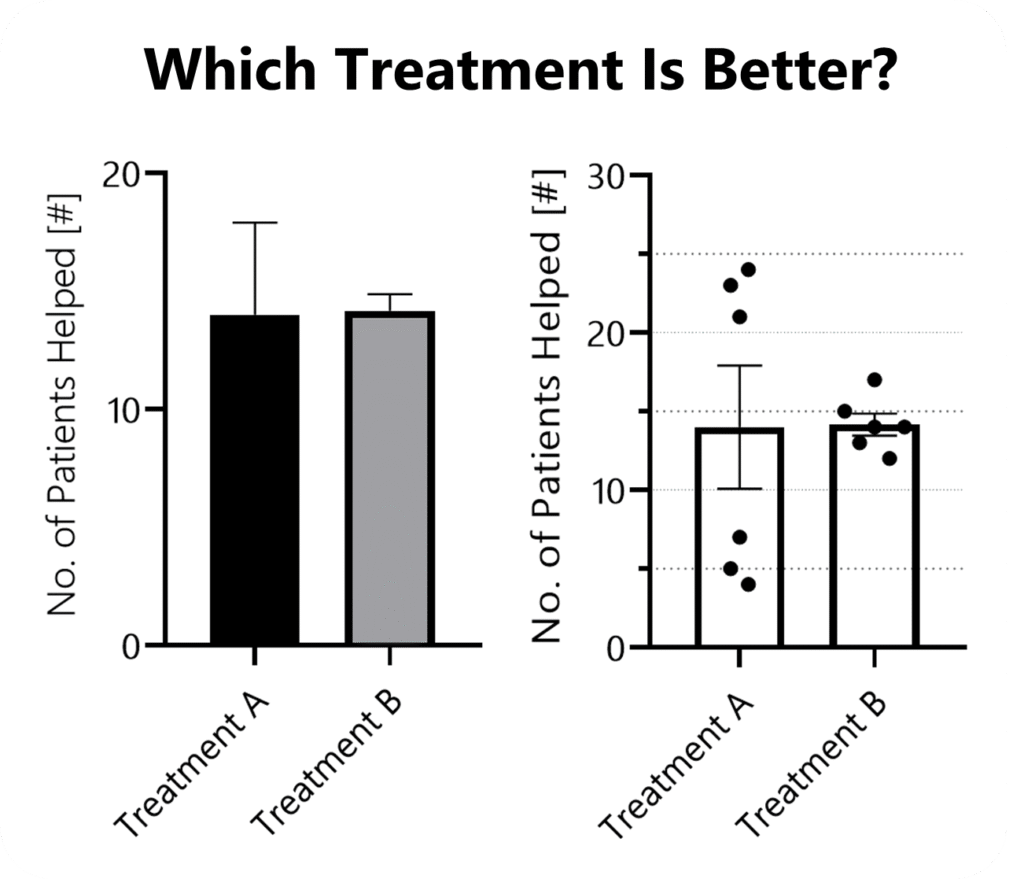
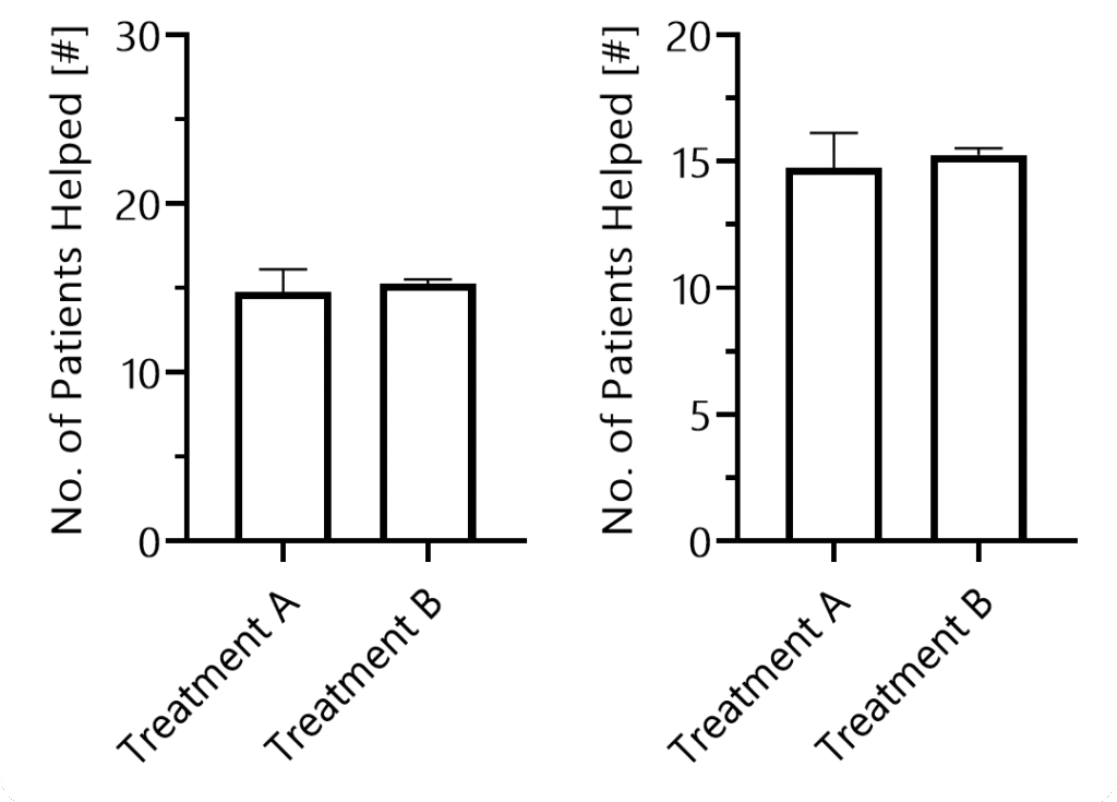
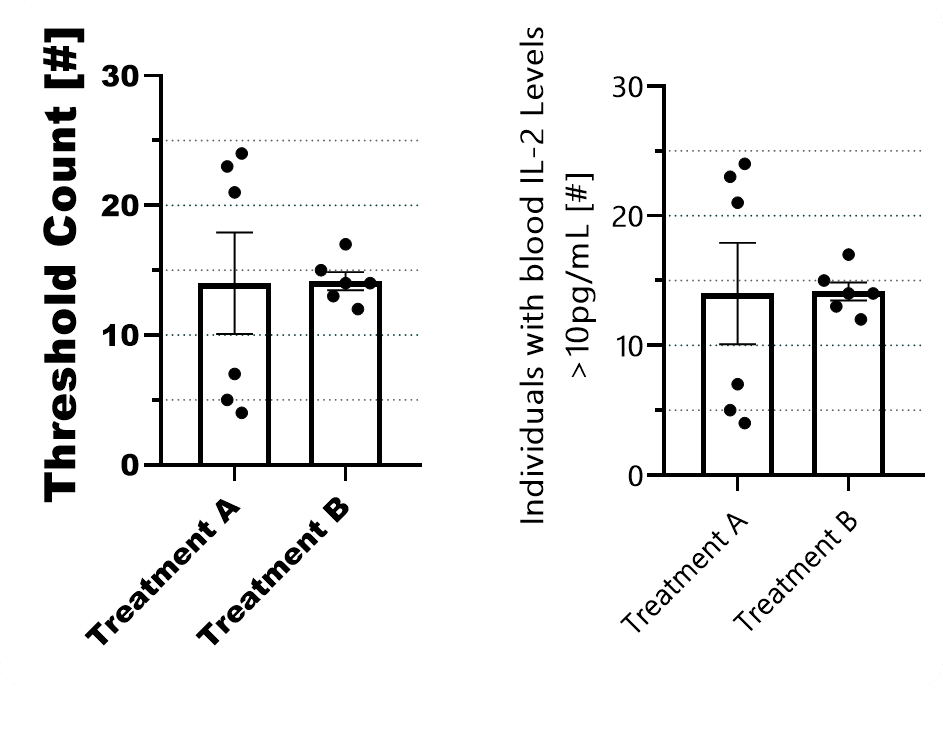
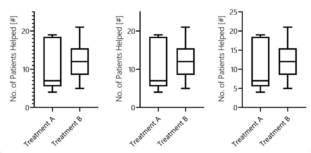
Imagine that six clinical trials, each with 30 participants, were conducted. If you only had three minutes to read the entire paper, it is unlikely you would draw the same conclusion when shown the graph on the left compared to the one on the right. Irrespective of the mean, the two populations only become evident in the right figure.
Design also shapes trust. Readers subconsciously judge the credibility of a study by the clarity and professionalism of its figures. Confusing or careless visuals can undermine confidence in otherwise solid data.
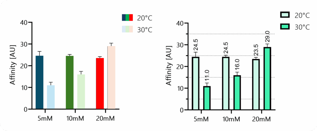
Could you reliably tell whether the dark blue bar is higher than the dark green one in the left figure? Nevertheless, the disharmonious choice of colors and the missing borders around the bars suggest that the graph on the left is less “professional.”
Finally, whether in posters or proposals, clear, well-designed graphics are far more likely to capture attention, be understood quickly, and be remembered.
Choosing The Right Graph Type
Most often, we default to those graph types we are used to.
A more scientific approach might be to start by defining the main message of each figure and the order in which information should be presented.
This clarifies what they should convey (and helps to determine their sequence in your paper).
How To Choose
To find an appropriate figure type, you want to ask two questions:
A) Will it display all relevant information? Think
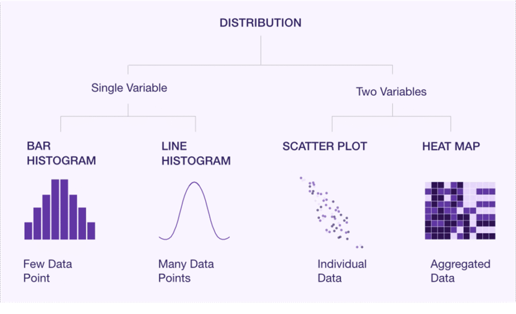
Distribution
Summary statistics such as means (i.e., effects & quantities)
Inferential statistics (SD, CI, or significance)
Inter-sample patterns or comparisons
B) What is visually the easiest to interpret?
What makes differences or similarities most clear?
What guides the eye of your reader?
What can be quickly screened?
Considering Digestability
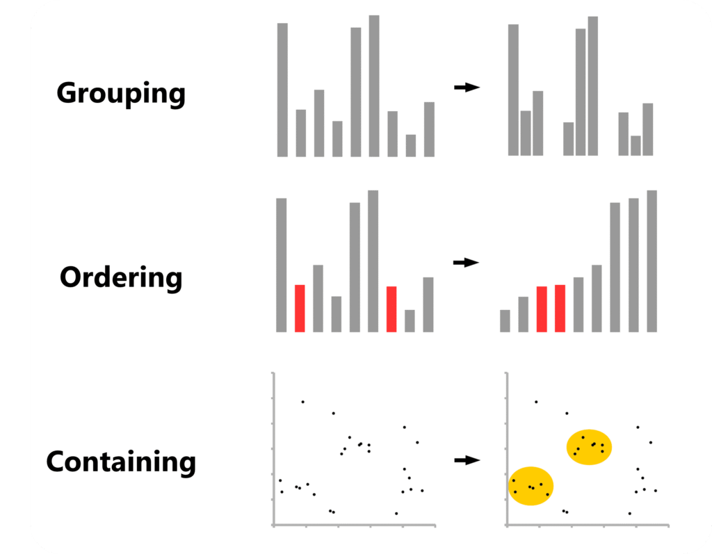
A good design guides the eye and minimizes how much information the reader has to hold in working memory. Legends are a classic example where smart design can make a big difference.
This example is taken from an excellent overview titled “Design Strategies for Scientific Figures” by the College of Natural Science at the University of Texas at Austin. As a rule of thumb, the faster you can understand a figure, the less mental effort is required.
Sometimes, it’s about applying principles of visual composition that help readers grasp information quickly:
As outlined by Aiora Zabala in “Designing More Effective Scientific Figures” (VTP Graphic Design, Cancer Research UK), grouping, ordering, and containing can help readers analyze data at a more hierarchical level and therefore process it faster.
Knowing Which Graphs Exist
After decades of research, new graph types are still getting “invented”.
However, even the fundamentals are not always properly taught in university. Therefore, here is some helpful resources:
Ardigen provides a nice walkthrough of the graph types available and also offers a clear overview that you can keep or turn into a poster.
Luzmo provides a solid overview of the basic chart types you should know.
Atlassian compiled an almost exhaustive overview, with more in-depth explanations of each chart type.
And Datawrapper offers a clear overview along with practical design tips. PS: Make sure to check the small “Example” and “How To” links at the end of each paragraph. For instance, you can dive deeper into when to use area charts or learn how to turn donut charts into bar charts.
The Data Visualization Catalogue also has a helpful search page where you can look up suitable graph types based on what you want to display.
Core Design Principles
Axis Dimensions
Once you compiled your data and chosen a figure type to display it, double-check whether your statistics program automatically chooses the range of your y-axis.
If your y-axis range is too large, differences between groups become visually harder to see, potentially misleading your audience.
Next, think about the dimensions of your graph in terms of the x-axis. Make sure your readers can visually assess all data points quickly.
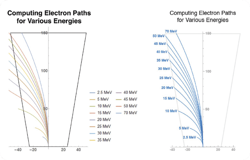
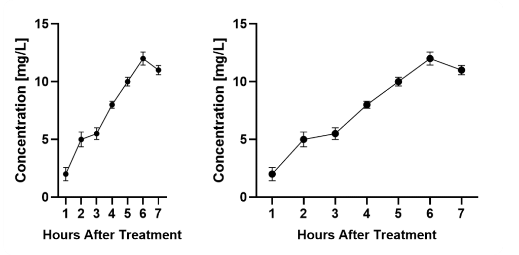
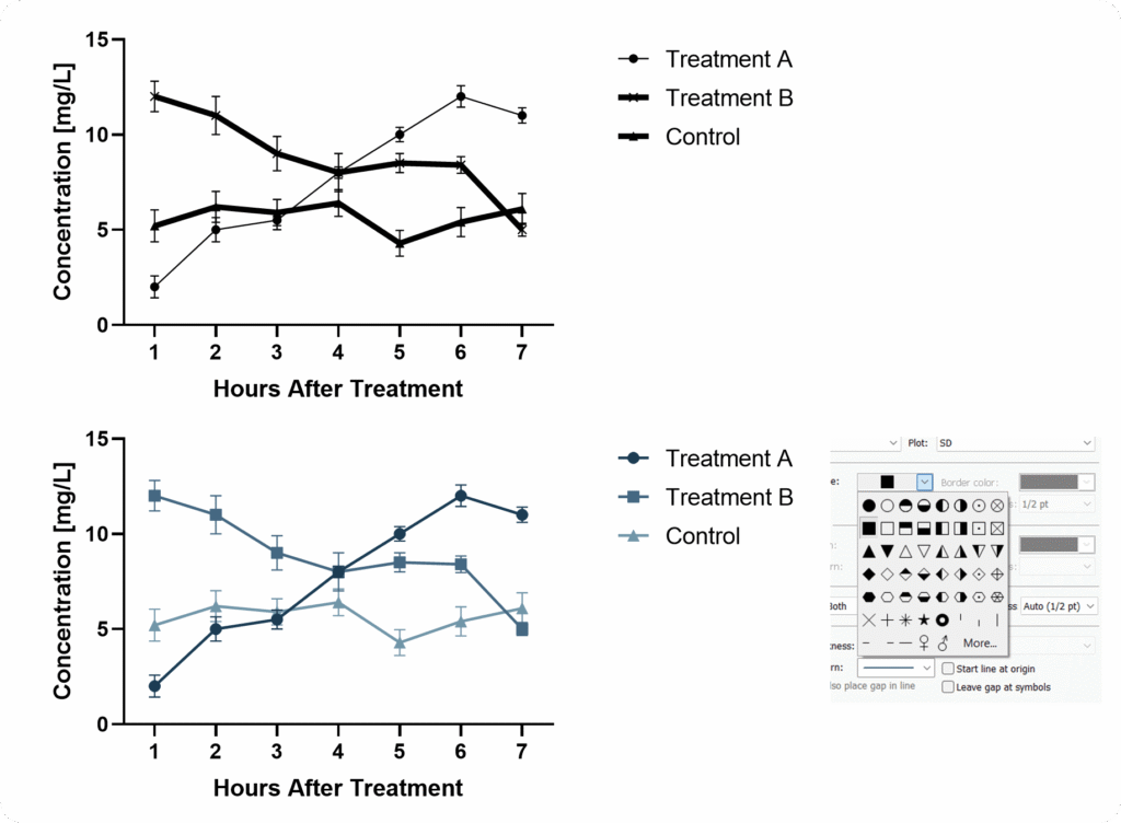
When it comes to curves, consider that the spacing of your x-axis has an important impact on the perceived slope of your graph. Again, there is no way around this. Also consider that the perception of your error bars will vary with the size of your graph. In both cases, mean values ± SD are displayed.
If you squeeze them too close together, it will become difficult. If you stretch the axis too long, it becomes harder to compare data points and differences.
Axis & Data Labels
Your axis labels should allow readers to immediately understand what is being displayed – even without reading the description or main text.
This is especially important because many readers simply scroll through figures to judge relevance.
Pay attention to where you place your legend when you have large panels. Don’t underestimate how long it feels when your eyes have to travel across several charts just to double-check the legend.
In complex setups, it can be helpful to add an additional panel showing the experimental setup.
Axis Ticks
When defining axis ticks, aim for clarity rather than minimalism or maximalism.
Ticks should help readers understand where bars or data points lie.
Line Thickness & Patterns
An often overlooked topic of utmost importance is line thickness. Several scientists might not even know that they can edit it in most software.
When using bar graphs you can choose patterns. But be careful, avoid overwhelming your reader.
When patterns don’t fit, consider differentiating through color – since we live in 2025, you don’t need to worry that your figures will be printed in black and white.
Color Harmony
One major issue is that we often believe we can choose colors arbitrarily.
But colors strongly influence how data is perceived. And without other supporting graphical elements, we cannot simply “overcome” biasing color.
Rainbow color schemes, for example, draw attention unevenly, and distract the eye. Light tones such as bright yellows are more difficult to see.
How statistics are displayed is critical to scientific accuracy – often as important as the analysis itself.
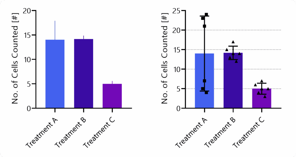
Effective visualization rests on two principles: show as much relevant information as possible (for example, individual data points), and avoid biasing the viewer through design choices.
Poor or selective presentation can mislead, especially when the presenter has a preferred interpretation. The goal is to let readers draw their own conclusions.
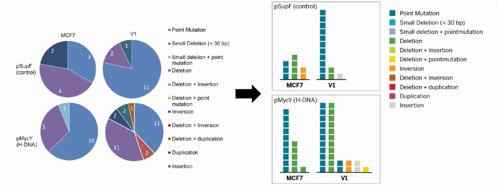
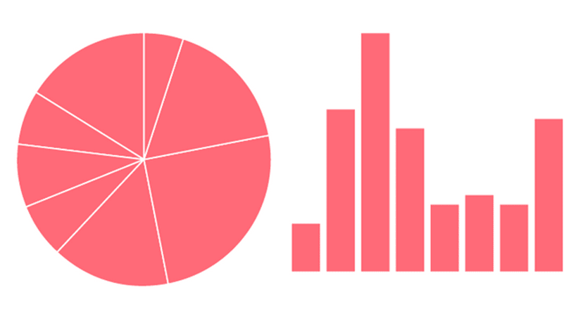
Ever wondered why you normally don’t see pie charts in scientific publications? Because they are suboptimal to read. A bar chart is much better for that purpose. This website has an amazing “game” that tests your ability to analyze different graphs.
Statistics should be clear and informative but visually secondary, supporting the data rather than dominating it.
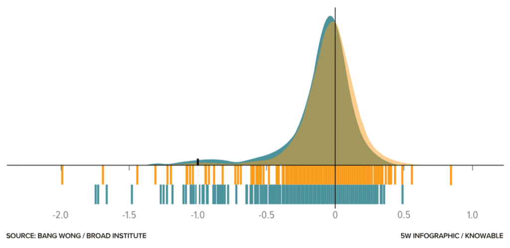
Adding information such as a barcode graph can help leverage the specific advantages of a given visualization technique and thereby allow the reader to gain a better understanding of the data.
The graph above taken from this blog shows the dependency of cell lines on the gene FOXA1 – those to the left of the minus-1 reference line require the gene to survive. Note that for lower frequencies of cell lines, the barcode graph is advantageous, whereas for high densities, the bell curve excels.
Subtle design choices, such as lighter colors and thin lines, help communicate information without distraction.
This is what I mean – the confidence bands make the graph more informative while also improving its appearance. More about such tweaks in this amazing blog.
And still, at some point, design and statistical expertise mix.
For instance, imagine we have to decide which variability measure to show. In bar graphs, you typically choose one of the following: standard deviation, standard error of the mean, or confidence intervals.
Remember, many scientists do not clearly understand the differences, and even fewer take the time to check which one is shown.
A Final Takeaway
OK, so how do you design figures properly?
What is the key message(s) of this figure?
Which data or samples do you need to show, and which statistics should you include?
What is the right graph type (e.g., does it properly show the data distribution)?
Which settings fit your data—should you show individual data points? What line thickness and tick frequency are appropriate?
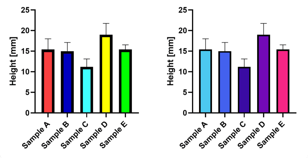
Choose colors wisely and keep them consistent throughout your paper and across samples.
If you follow these five steps, your figures will look better than the majority of those printed in papers.
Bonus: When designing figures for presentations or posters, it is acceptable to leave out some samples and use larger labels or thicker lines. Again, put yourself in the shoes of your viewer!
Did you like this article?
I share even more detailed insights and cover additional topics such as designing posters or graphical abstracts in our weekly educational series.
An AI research assistant for literature discovery and exploration. It helps you find relevant papers, extract key insights, and plan your own experimental strategy.
An AI for data analysis and visualization. You can upload datasets, ask questions in written form, and generate statistics, graphs, and insights without coding.
An AI tool for reading and understanding scientific papers, although it also offers several agentic work modes that allow you to perform a number of other tasks.
ChatGPT 5.2, with its advanced reasoning, is one of the best-performing AIs – across all functionalities. In other words, every other specialized AI tool had only marginal advantages.
Although it provides less user guidance, it offers the greatest flexibility given that it works with written prompts.
That means if you only want to use a single tool, this is it.
Literature Review and Paper Discovery Tools
Literature review tools are designed to help researchers quickly find, filter, and understand scientific papers. They search large academic databases, summarize key findings, and highlight relevant studies. These tools are especially useful for early-stage research, systematic reviews, and exploring unfamiliar topics.
When to use: Amazing functionality that can save hours of work. Furthermore, it can unearth papers that would stay hidden through normal Google searches.
Main limitations: One cannot be sure whether a search was exhaustive. Moreover, caveats such as differences in the interpretation of results or methods made by humans cannot be corrected by AI. Therefore, a literature search can only be as robust as the underlying science.
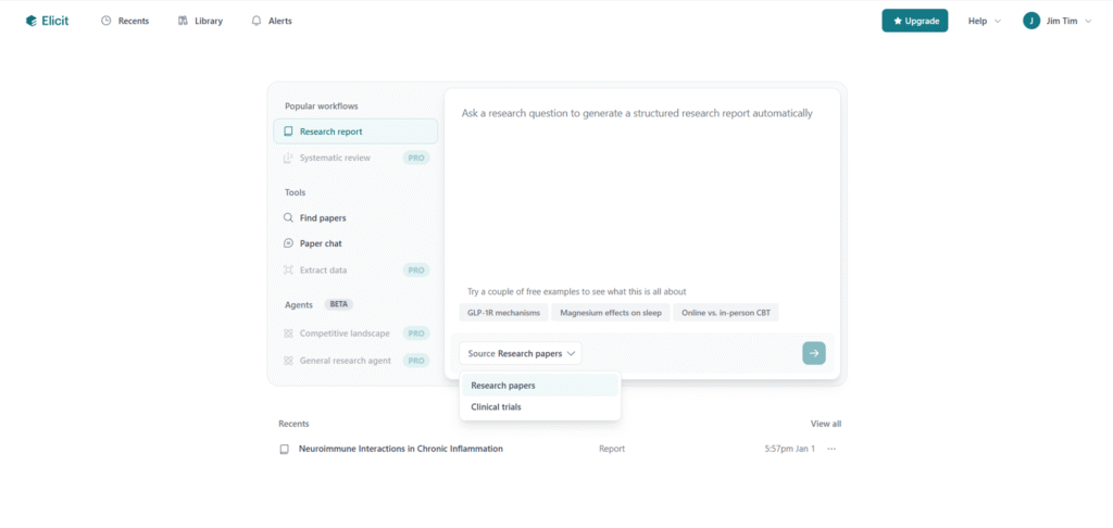
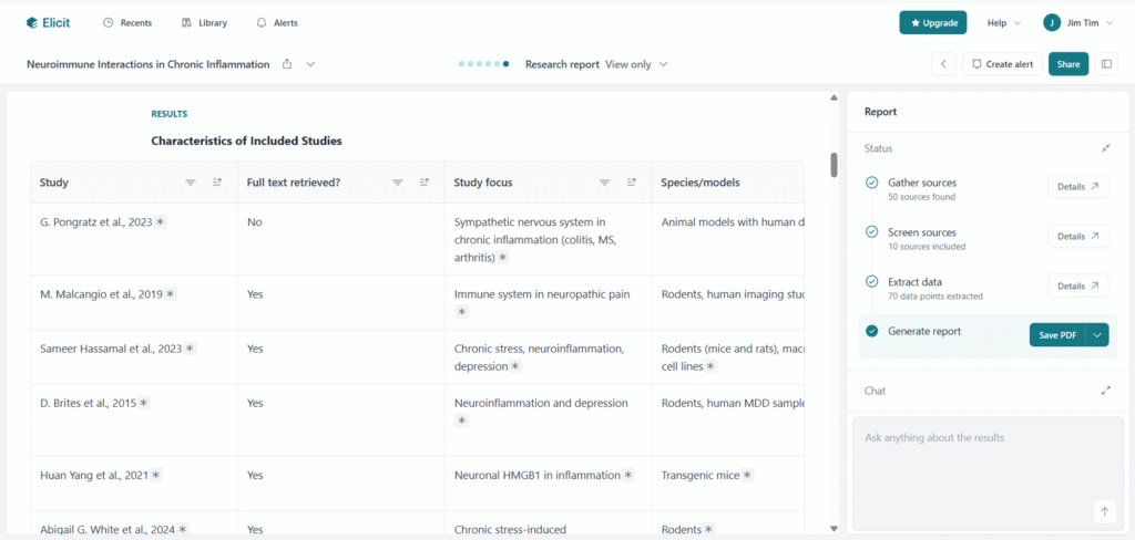
Based on written prompts, Elicit allows for the creation of literature reports, finding of papers, or using “paper chats” to explore single publications. It can present information in different formats, including text summaries and tables, which makes it easier to compare studies quickly.
Yes, I know, how can I not use AI tools in dark mode … And I also know about the inofficial definition: only if it has a dark mode it is a real AI tool 😀
One useful feature is its ability to refine vague or poorly phrased prompts for higher efficiency.
However, it’s not always clear how comprehensive the search results are – whether there would potentially be more papers that simply weren’t caught or analyzed.
When searching for less-researched topics, even with filters like “animal studies only,” the tool often returned many irrelevant papers, despite being labeled as irrelevant.
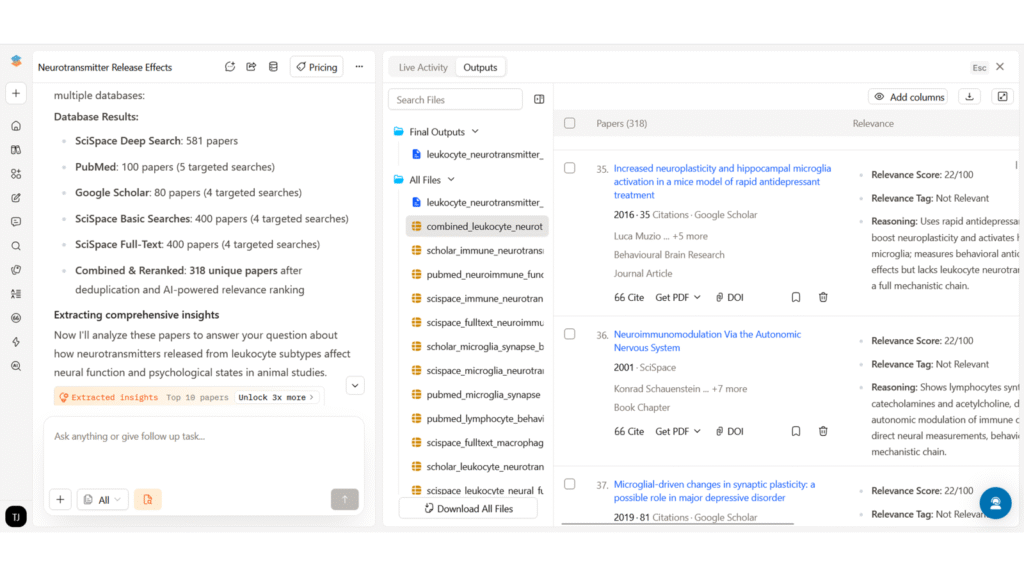
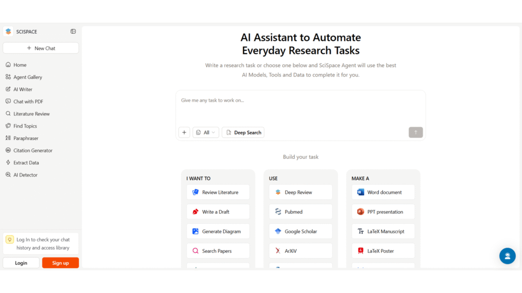
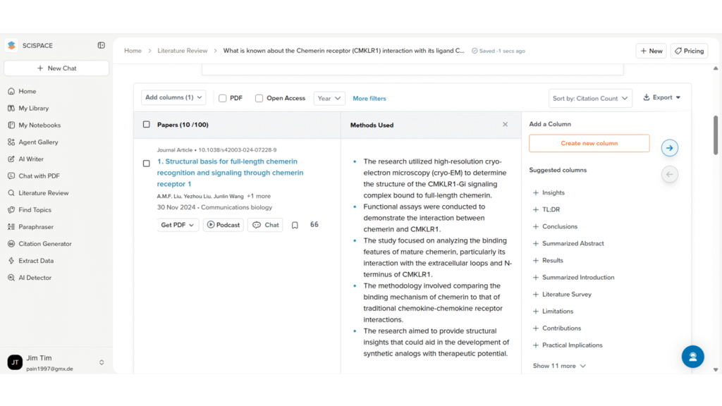
SciSpace’s deep research mode can retrieve a large number of papers and assign relevance scores. The ability to manually browse through all of them is helpful for more systematic reviews.
Moreover, the information is displayed in well-structured and interactive tables.
The main drawback is that free credits are used up quickly. Also, when attempting complex tasks, such as creating a detailed PowerPoint presentation, the system can overload and fail to complete the task, making it frustrating to use for larger projects.
Of note: SciSpace offers several functions beyond basic literature search, such as graph design or text generation.
However, the limited credits remain a limitation, and its functionality in these areas didn’t seem superior to other tools. Still, its real-time suggestions to improve prompts, especially when switching between different features such as search, writing, and presentation tools, can be very helpful and time-saving.
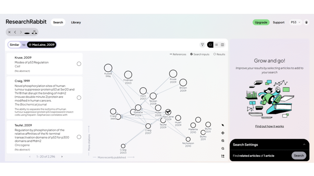
Research Rabbit focuses on finding similar and citing articles. It visualizes connections between papers in a network-style map, which can be helpful for exploring how research topics are linked, which papers influenced others, and which studies are closely related.
In theory, this can be helpful for identifying key papers in a field and understanding how ideas have developed over time.
In practice, however, the search function does not always work very well. Even when the tool indicates that thousands of similar papers exist, it only shows a small number of them.
Very similar to Research Rabbit, Connected Papers shows related research articles in a visually appealing connection map based on the Semantic Scholar database.
It is quick and easy to use, and the visual layout helps users understand how studies are linked.
However, some papers found by the search engine are not included in the map, and for broad topics, the retrieval is still suboptimal.
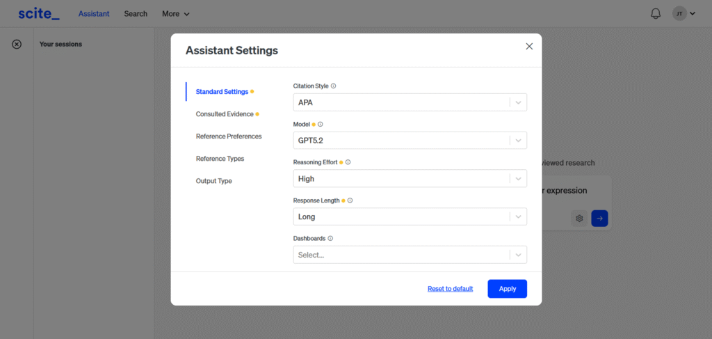
Scite provides standard literature search functionality and shows how papers are cited in context. Compared to ChatGPT alone, it tends to stay more focused on the specific question being asked.
However, it is not very exhaustive, and its scope is narrower. While it avoids overly broad answers, it also misses a lot of potentially relevant literature.
Personal Tip: AI-generated literature summaries will reflect the biases (e.g., overinterpretation of data), ambiguities arising from imprecise definitions (such as what qualifies as chronic stress), contextual dependencies (for example, statistical significance versus biological relevance), and even the errors present in the original papers themselves. Apparent coherence or authority, whether in the literature or in AI-generated outputs, does not guarantee completeness or accuracy.
Therefore, reviewing your prompt strategy (e.g., what is “short term?) as well as vigilance is important. It is easy to get mislead when a summary is based on a single (or a few) studies and miss an important factor, such as an alternative receptor, a splicing variant, or an environmental variable that is simply not mentioned.
AI Research Assistants and Scientific Reasoning Tools
While these two tools are able to conduct literature searches, instead of providing an overview, they are more focused on finding answers to specific inquiries, explaining scientific concepts, and discussing limitations or experimental design. They are strong at reasoning through complex questions in clear language and can provide context that goes beyond simple paper summaries.
When to use: You want feedback or need specific literature for an experimental approach. These tools help you find anything from antagonists to appropriate time points.
Main limitations: You have to double-check – although their output is often precise, it might stem from a paper with a different scope or experimental setup. Moreover, don’t give in to the perception that conducting the experiment will be easy or come without surprises.
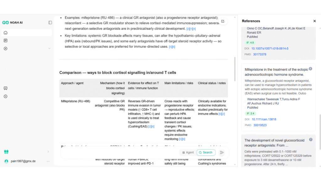
Noah AI performs very well for scientific questions, even when they are nuanced. It provides clear text explanations, tables, highlighted limitations, and even practical details such as concentration ranges, statistical considerations, and appropriate cell seeding densities.
It also allows for long, detailed research outputs with a high token limit, which makes it useful for in-depth scientific exploration.
The main weakness is the unstable interface, which hides labels on the main screen, requiring “experimental clicking” if one wants to use other tabs or additional functionalities. Hopefully, this will be a quick fix for the web designers.
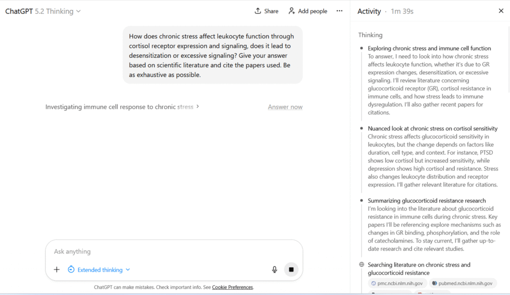
In essence, ChatGPT can help you calculate statistics, create a research plan or find relevant paper.
Overall, ChatGPT performs well in terms of reasoning and explaining complex topics in a structured way. It is also good at discussing limitations and caveats.
While other tools are specifically trained, ChatGPT sometimes has to be re-prompted to obtain additional or more nuanced information.
However, it is not exhaustive in its literature coverage. Moreover, sometimes a different prompting strategy or starting a new chat is necessary to avoid stereotypical answers.
Data Exploration and Visualization Tools
Data exploration, visualization, and design tools support you in turning data and ideas into clear visual outputs. Additionally, they can help you explore datasets, quickly generate graphs, and receive basic explanations of trends, including significance tests or suggestions for suitable visual formats.
When to use: They are fantastic for beginners – they allow you to get a fast overview of unfamiliar data, find trends, and draft visualizations. Especially for those who do not have a knack for statistics, they can be extremely helpful.
Main Limitations: Large datasets with nuances will still require human judgment. Moreover, designed graphs are rarely publication-ready – at best, you can use them for presentations or quick communications. Take care not to share sensitive information or unpublished work, as data may be processed and stored on external servers.
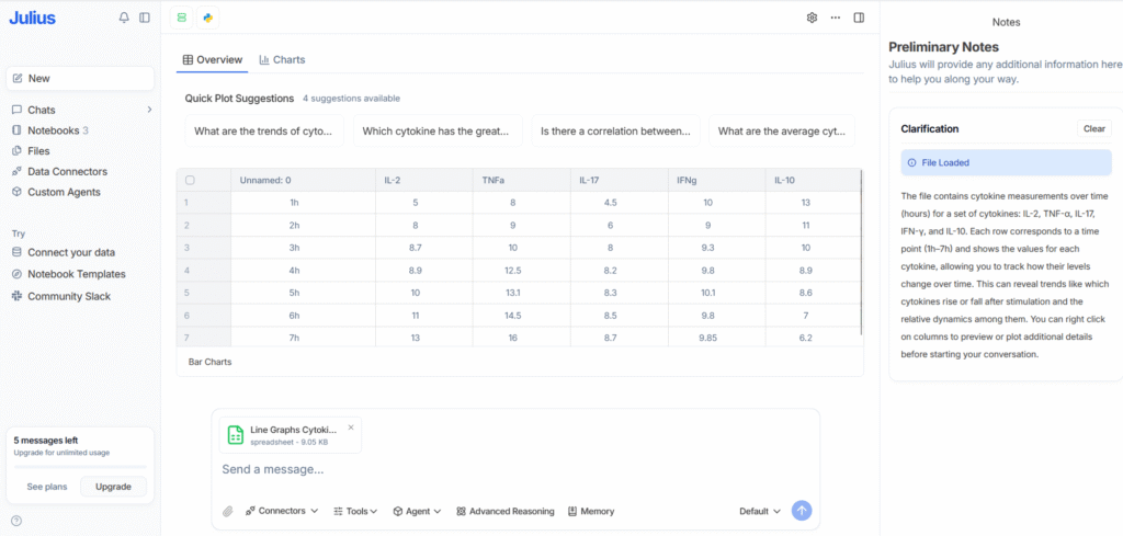
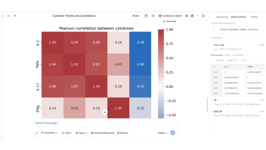
Julius AI is particularly good for basic data exploration. It quickly provides insights into data interpretation, clear text explanations, and generates graphs.
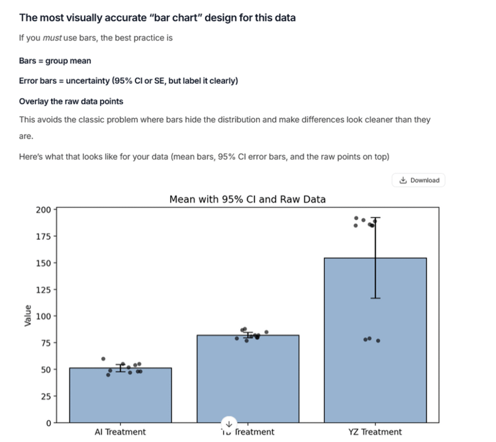
Along with correctly identifying statistical nuances and appropriate tests, it can really lay the foundation for data analysis. It also suggests visually appropriate bar chart designs, which helps avoid misleading visualizations.
While it can modify graphs upon request, for publication-ready designs you will still want to use statistical software.
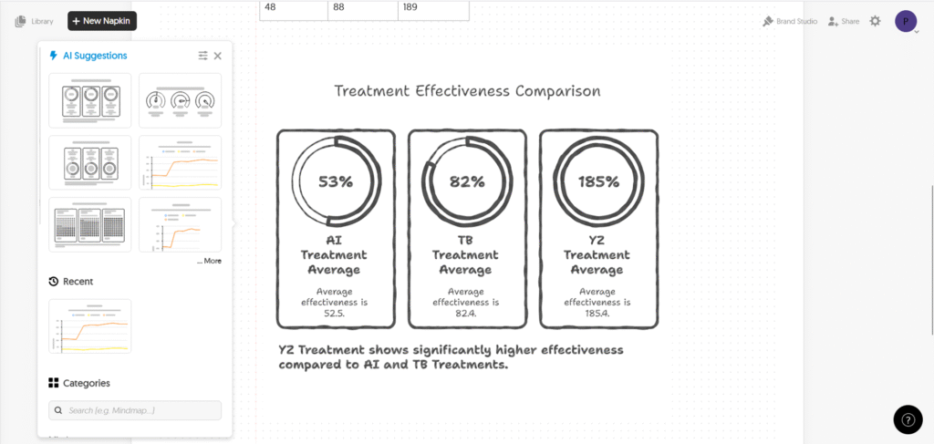
Napkin AI is well suited for creating diagrams and creative visual content that can be used in presentations, posters, blogs, or internal communications.
While you can draw charts or upload your data, it does not analyze data and is not designed for statistical or scientific work.
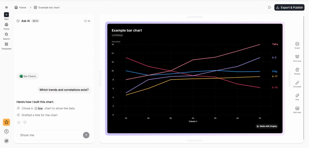
Graphy is mainly a design-focused tool for creating modern-looking charts. While the visuals are appealing, it does not provide meaningful data analysis, and the AI features are not very robust.
It is better suited for presentation design than for scientific interpretation.
Datawrapper is useful for quick data visualizations. It does not include advanced AI features, but its simplicity makes it fast and easy to use.
The downside is that customization options are limited.
Grammar and Writing Tools
Writing-focused tools aim to improve language quality, correct grammar, and sometimes rephrase content. They are mainly useful for polishing manuscripts or refining notes. Some offer functionality to formulate text from bullet points, check for AI-generated content, or detect plagiarism.
When to use: Generally, grammar correction tools are very useful for science students and non-native English speakers. These tools only seem useful if you want a quick add-in for Word; otherwise, use ChatGPT.
Main Limitations: Overall, functionality and performance are rather disappointing. In almost all cases, ChatGPT performs better. Take care not to share sensitive information or unpublished work, as data may be processed and stored on external servers.
In terms of performance, it works reasonably well for grammar correction, but doesn’t offer any convincing functionalities other LLMs couldn’t perform.
While it can save time because it is integrated into Word, its features are rigid, and functions like the title generator perform limited and sometimes poorly.
Its specialized grammar tools perform relatively well. The journal finder, while an interesting feature, is very limited, and overall functionality is quite narrow.
Tools for Specific Analysis Use-Cases
The following tools are not mere add-ins or online software interfaces; they require some amount of coding or extra effort to run locally. However, they demonstrate that for specific use cases, AI tools can make analyses much faster and more functional.
A genomics AI tool from Google that uses deep learning to call genetic variants from DNA sequencing data. DeepVariant treats sequencing reads like images and classifies sites as variant or reference, often achieving higher accuracy than traditional algorithms.
Large Language Models
There are also several large language models trained specifically on biomedical literature (e.g., PubMed abstracts and papers). For example, BioGPT is designed to answer biomedical questions and generate text in a scholarly style. However, these models often need to be run locally or integrated into Python workflows.
Grant Writing Tools
Of course, there are also grant-writing AI tools available. While most of the writing is still up to you, tools like Grantable or Grant Review AI can help you write more efficiently or, in the latter case, provide feedback that is similar to real grant reviews.
Offers antibody search for academic scientists and pharma target verification and research for enterprises.
Enterprise Solutions for Companies and Large Scale
For those of you who work in companies, plan a spin-off, or have larger capacities, there are several AI options available (only) to enterprises. Obviously, these come with a price tag, but they often include personal support and more advanced models.
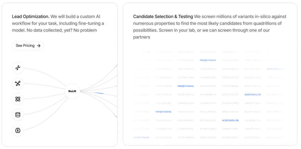
Used for molecular lead optimization. It provides custom AI workflows, including model fine-tuning.
For example, it can screen millions of variants in silico against numerous properties to identify the most likely candidates from quadrillions of possibilities.
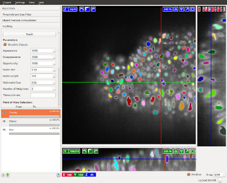
A cloud-based image analysis platform that uses AI (deep learning) to help pathologists and researchers analyze microscopy images (e.g., histology slides and tissue samples).
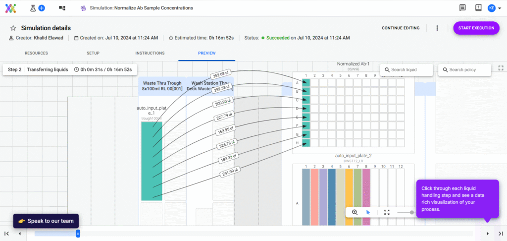
Allows you to design complex, robot-automated workflows yourself. It helps you keep an overview of complex processes, speed up and automate liquid volume calculations, and plan new workflows.
A platform for automated machine learning (AutoML) that can be applied to scientific datasets. DataRobot can ingest data (omics tables, clinical data, etc.), test many modeling approaches, and output the best predictive models without the user needing to code.
A transformer-based, multimodal AI model that integrates multi-omics data—including proteomics, RNA sequencing, and DNA methylation—across multiple species, tissues, and cell lines. It supports tasks such as aging research, disease modeling, drug discovery, and synthetic data generation. It can both synthesize and interpret complex biological data from diverse experimental settings.
And Many More
Of course, you will also find several solutions that combine or specialize in the functionalities of other tools. To name a few examples, Pandaomics BigRNA focuses on predicting detailed RNA regulation (such as splicing and polyadenylation).
Other companies offer AI solutions that help you process your data, such as IBM’s AI agents that integrate with your existing data and applications.
Final Word & Explanation
I hope this overview will prove useful to you.
I was truly surprised by the statistical accuracy and experimental design capabilities.
The literature review tools will certainly prove helpful, especially when starting a new topic or wanting to dive deeper into a hypothesis.
My biggest surprise, however, was the grammar and writing tools. I was genuinely concerned that they would pose a big temptation, especially for young scientists.
In reality, they proved to be far inferior to ChatGPT. In other words, while LLMs can truly enhance grammar and flow, the basic structure and content of a good article must still come from a human.
Part of the reason why some of the tools performed so poorly is that they simply leverage ChatGPT as an input. In other words, behind the buttons you click, they just forward a prompt to ChatGPT and print out its answer.
However, since these prompts are often general (not adapted to your specific use case) and sometimes use older ChatGPT versions, the output is simply poor.
Please also remember that I tested these tools with a limited number of prompts and tasks. If you use them, you will surely find other shortcomings or use cases.
Moreover, I used the free versions, as you probably will initially too. The paid versions often provide unlimited access, advanced setting options, and, especially for review tools, a larger number of studies included in reports.
Still, keep in mind that there are other tools out there that I couldn’t include here, and we continuously see new ones being added.
In my opinion, AI tools can already help you significantly with literature, analysis, and grammar tasks, but they remain just that: tools. No AI will do the work for you—whether it’s experiments, thinking, or writing.